SwiftUI for Mac 2022
17th June 2022 • 2,711 words • 14 minutes reading time.
In December 2019, I wrote a series of articles about using SwiftUI to build a Mac app. And in July 2020, I re-visited the sample app to apply the new SwiftUI features made available in macOS BigSur. Now that macOS Ventura and Xcode 14 are in beta, it's time to build the app again while learning how to incorporate the new APIs.
Right now, it's June 2022 and I'm using macOS Ventura 13 beta 2 (22A5286j) with Xcode 14 beta 2 (14A5229c). There will undoubtedly be changes before release, but I'll try to update this article or add notes to point out any major differences.
I don't intend to cover features that haven't changed much, but here are the new APIs that I am interested in:
- Navigation
- Detecting the Active Window
- Opening New Windows
- Charts
- Image Rendering
- Forms
- Menu Bar Apps
Note: In Xcode 14 beta 2, the SwiftUI Previews are crashing unless I go to Project > Target > Signing & Capabilities and select my developer team and set Signing Certificate to Development. So if you can't see the Previews, make these changes, or run the app directly.
Navigation
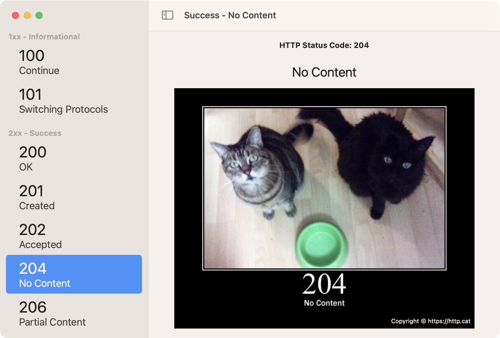
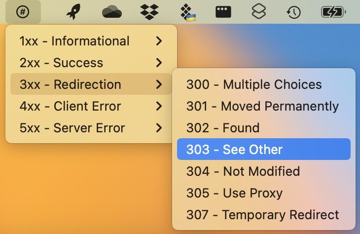
The first version of this app used a two pane layout with a sectioned list in the sidebar leading to a detail view in the main area. With the Big Sur version, I switched to a three pane layout because the sections were not displaying neatly. This time, I've reverted to two panes with sections. As before, I'm using HTTP Cats which is a site that serves up a cat image to match almost every HTTP status code.
Previous versions used NavigationLinks inside a NavigationView. NavigationView is now deprecated and we should use either NavigationStackView or NavigationSplitView. NavigationStackView is better suited to a small screen where each view is pushed on to a stack and can be popped off to navigate back. I am going to use NavigationSplitView which works well for bigger displays with all the panes visible at once.
My data model is exactly the same as I developed originally and consists of an array of HttpSections, each containing an array of HttpStatuses.
So I was able to render my navigation like this:
NavigationSplitView {
  List(httpSections, selection: $selectedStatus) { section in
    Section(header: Text("\(section.headerCode) - \(section.headerText)")) {
      ForEach(section.statuses) { status in
        SidebarRowView(code: status.code, title: status.title)
          .tag(status)
      }
    }
    .font(.headline)
  }
  .frame(minWidth: 250)
} detail: {
  DetailView(sectionTitle: sectionHeader, httpStatus: selectedStatus)
}
The NavigationSplitView takes various parameters, depending on the result you want. In this case, the first parameter lays out the sidebar, which is a List. The detail parameter contains the detail view. For the List, I loop through the sections, adding a section header for each one and a custom SidebarRowView to display the individual status entries. The List selection is bound to an optional HttpStatus. The key here is to give each row a tag that maps to the status displayed in that row. If you omit the tag, the sidebar draws but none of the entries are selectable.
Interestingly, when you create a navigation setup like this, Xcode automatically adds a toolbar with a button to toggle the sidebar. This has always been essential as there is a long-standing bug where a hidden sidebar cannot be dragged back into view. But adding it manually meant digging into AppKit to find a method to call.
Not so interestingly, the sidebar is often hidden on app launch. I tried giving NavigationStackView its optional columnVisibility parameter, but no setting made it appear consistently.
With the detail, right now there is a bug where you cannot unwrap a conditional and show a view based on that. One workaround is to wrap the entire detail in a ZStack, but in the interest of keeping my ContentView code simple and as short as possible, I added an intermediary view. DetailView takes optional parameters and it decides whether to show the StatusView or a placeholder. Note: the bug may have gone in beta 2, but as I want to display other UI elements in the detail view anyway, this is still a neater approach.
There is nothing much new in either of these views, except where StatusView downloads the selected cat image. I tried using AsyncImage which worked really well except for one problem. When I selected a new status, the old image stayed in place until the new one arrived. I was unable to work out how to clear or reset an AsyncImage so it would show its placeholder again.
Update: Thanks to @ramzesenok who pointed out that this is another case where I could use an id to force a refresh. So now, the app uses AsyncImage which makes for a lot less code.
AsyncImage(url: httpStatus.imageUrl) { img in
  CatImageView(catImage: img, statusCode: httpStatus.code)
} placeholder: {
  ProgressView()
}
.id(httpStatus)   // this resets the AsyncImage whenever httpStatus changes
If anyone is still interested in the async/await version, check out this earlier commit on GitHub. It does appear to have better/faster caching, but a beta is not the right place to make speed assessments.
However I did switch to using async/await to download the image.
Updating this was also slightly complicated. I downloaded the first selected image using a task modifier and downloaded subsequent selections using an onChange modifier. Both of these were required to show the image every time.
Thanks to @davbeck, @malhal and @chriseidhof for pointing out that if I gave the task an id, it would be called whenever the id property changed.
The previous image is first set to nil, so that the progress indicator appears.
With all this in place, I had the basis of the app and the navigation was complete:
Detecting the Active Window
macOS apps can have multiple windows open at once, and in previous iterations of SwiftUI, it has been difficult to detect the active one. Last year, we got @FocusedBinding but it didn't really work. This year it works, but we also have a new EnvironmentValue called controlActiveState.
As I did last time, I set up some menus by adding a commands modifier to my WindowGroup in the main _App.swift file. First, I added the pre-built SidebarCommands() which added a menu item and keyboard shortcut for toggling the sidebar. Next, I added a menu item for flipping the image:
CommandGroup(after: .textEditing) {
  Button("Flip Image") {
    NotificationCenter.default.post(name: .flipImage, object: nil)
  }
  .keyboardShortcut("f")
}
This new item appears in the Edit menu, after the standard items. It has a shortcut of Command-F. The Command key is the default shortcut modifier, so if you only specify a letter, it automatically uses Command. All this menu item does is to broadcast a notification.
The image is shown in a subview called CatImageView which now includes the following properties:
@Environment(\.controlActiveState) private var controlActiveState

private let flipImageMenuItemSelected = NotificationCenter.default
  .publisher(for: .flipImage)
  .receive(on: RunLoop.main)

@State private var imageIsFlipped = false
The image has a rotation3Deffect modifier with the angle set to either 0 degrees, or 180 degrees, depending on the value of imageIsFlipped.
The view subscribes to the flipImage notification and receives it like this:
.onReceive(flipImageMenuItemSelected) { _ in
  if controlActiveState == .key || controlActiveState == .active {
    imageIsFlipped.toggle()
  }
}
When the notification arrives, the code checks the value of controlActiveState. In my tests, this was always either key or inactive, but I saw that active was an option and added it too, in case it becomes relevant later. If the CatImageView is in the active window, it flips the image and if not, this notification is ignored.
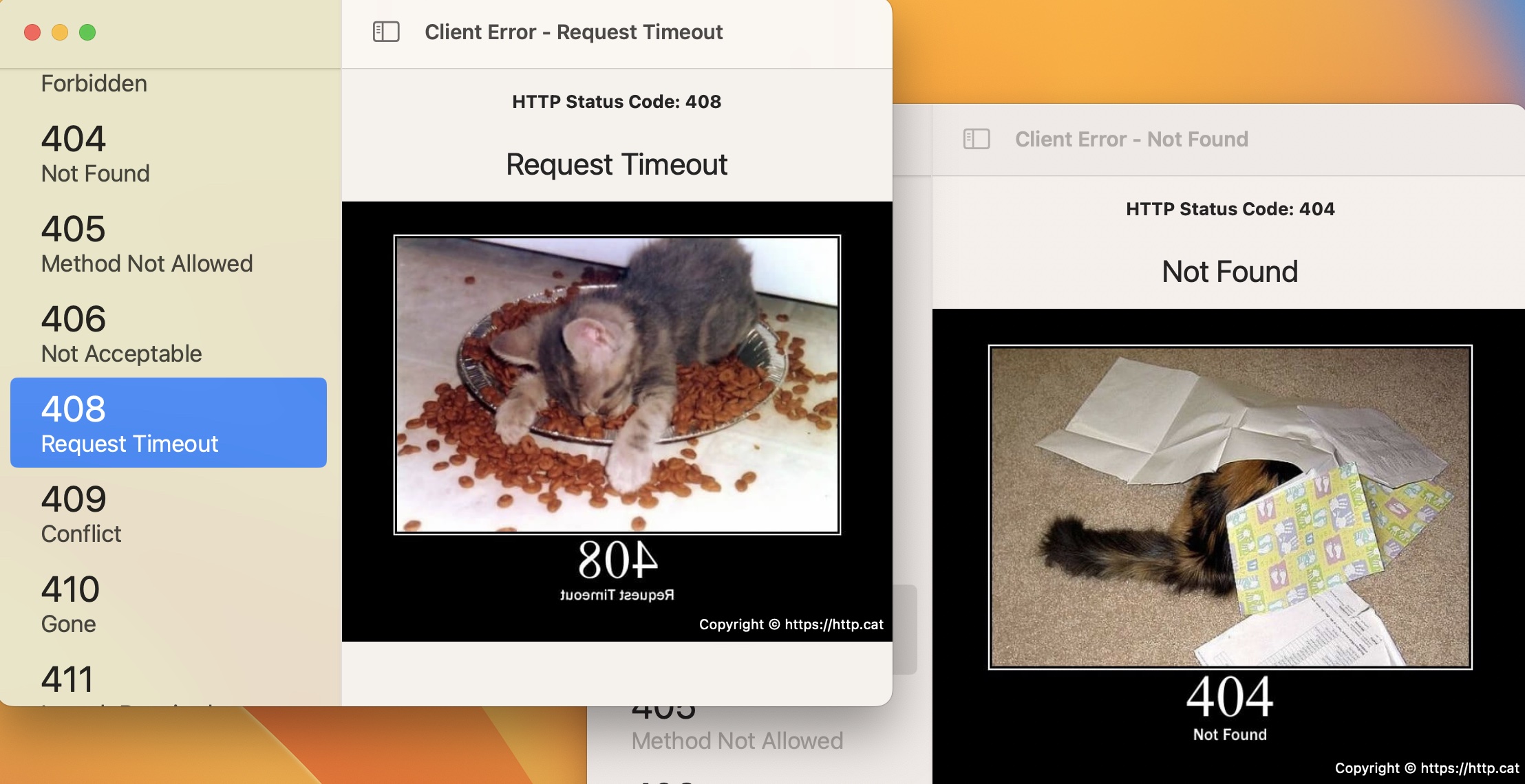
As you can see from the text in the images, only the front window image is flipped.
Opening New Windows
In early versions of SwiftUI, opening a secondary window was a very complex process. Read part 2 of the original series to see how I struggled with this. Later, we got an easy way to open a Preferences window, using a Settings scene. Preferences are now called Settings, which makes this nomenclature more logical.
Last year, we got the ability to use a NavigationLink as a SwiftUI menu item and this will open the destination view in a new window.
This year, we have a new method that uses another new EnvironmentValue called openWindow. First, in the _App.swift file, I added another new scene to the body - this time a second WindowGroup. A WindowGroup can be passed an id, a data object of a specific type, or both. In this case, I didn't want to pass any data, so I gave it an id:
WindowGroup(id: "ui_samples") {
  SamplesView()
}
I want to display a window with a view demonstrating some UI elements. The view is called SamplesView, so I set this as the content of the WindowGroup.
To use it, I added a property to DetailView:
@Environment(\.openWindow) private var openWindowAnd inserted a Button to call it:
Button("Show UI Samples") {
  openWindow(id: "ui_samples")
}
This opens a new window with the appropriate id. This can open multiple copies of the same window. If I had passed a data object to the window, it would have brought the window containing that data object to the front instead of opening a new window. To test this behavior, I changed the WindowGroup to this:
WindowGroup(for: String.self) { _ in
  SamplesView()
}
And changed the Button to:
Button("Show UI Samples") {
  openWindow(value: "samples")
}
Now the WindowGroup expects a String. When you pass a String that has already been attached to a window, that window is brought to the front. If you pass a different String, you get a new window.
After that, I realized that there was another scene type I could use. If you create a Window scene instead of a WindowGroup, not only does this become a single presentation window, but you get a menu item for it in the Window menu without any extra work. You can add a keyboard shortcut to the Window scene too. Supposedly, you can add default sizing and positioning, but they don't appear to work yet.
Window("Samples", id: "ui_samples") {
  SamplesView()
}
.keyboardShortcut("u")
.defaultPosition(.topLeading)  // doesn't work yet
.defaultSize(width: 600, height: 600)  // doesn't work yet
Charts
One of the signature features of SwiftUI at WWDC 2022 was the new Charts API. I have struggled with charts in the past, so this was very interesting. I need to learn more, but I added a simple bar chart to the samples window:
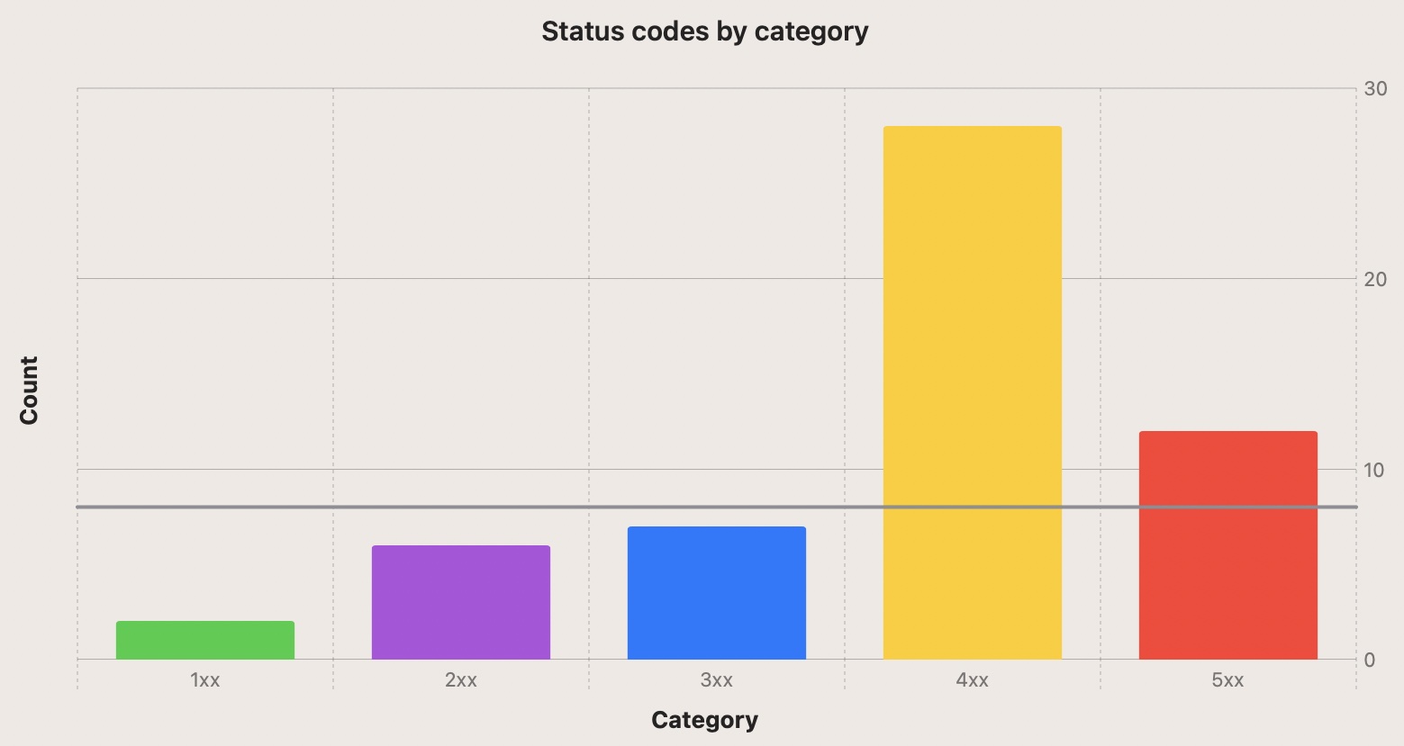
This charts the number of entries in each category of HTTP status. I drew a line across at the 8 value because drawing a marker line is a feature I have often needed in charts.
Creating the chart was smooth:
Chart {
  ForEach(chartData.keys.sorted(), id: \.self) { key in
    BarMark(
      x: .value("Category", key),
      y: .value("Count", chartData[key] ?? 0)
    )
    .foregroundStyle(by: .value("Color", key))
  }

  RuleMark(y: .value("Threshold", 8))
    .foregroundStyle(.gray)
}
Having assembled a dictionary of category codes and counts, I looped through the keys, setting an x and y value for each in its own BarMark. The line used a RuleMark.
To get the different colors, I added this modifier to the Chart:
.chartForegroundStyleScale([
  "1xx": .green,
  "2xx": .purple,
  "3xx": .blue,
  "4xx": .yellow,
  "5xx": .red
])
which was used by foregroundStyle to assign a different color to each of the categories.
Next, I wanted to add the ability to switch between vertical and horizontal bars. This requires swapping the x and y data so that y has the category and x has the count. After testing this manually, I added a Boolean to specify the orientation, and a method for returning the appropriate BarMark:
func barMark(for key: String) -> BarMark {
  if drawHorizontal {
    return BarMark(
      x: .value("Count", chartData[key] ?? 0),
      y: .value("Category", key)
    )
  } else {
    return BarMark(
      x: .value("Category", key),
      y: .value("Count", chartData[key] ?? 0)
    )
  }
}
A similar method provided the RuleMark as either a vertical or horizontal line.
A segmented picker switches between the two and the only thing now was to animate the change. There is an animation modifier added last year that allows you to connect an animation to a property, so that when the property changes, the animation is triggered.
.animation(.easeInOut, value: drawHorizontal)
I added Text views for the title of the chart and for the axes, inside a VStack and an HStack, rotating the text for vertical axis. Maybe there is a chart setting that I'm missing for adding these labels automatically using the Chart library.
Image Rendering
While investigating charts, I experimented with another new SwiftUI feature: ImageRenderer. When I have made charts, I've often wanted to export them as images for upload. ImageRenderer allows us to convert a SwiftUI view into an image: on macOS, either NSImage or CGImage.
The first step was to convert the chart view plus its labels, into a variable (modifiers and RuleMark omitted from this code snippet for brevity):
let chartView = Group {
  Text("Status codes by category")
    .font(.title3).bold()
    .padding()

  HStack {
    Text(drawHorizontal ? "Category" : "Count").bold()
      .rotationEffect(.degrees(270))

    Chart {
      ForEach(chartData.keys.sorted(), id: \.self) { key in
        barMark(for: key)
      }
    }
  }

  Text(drawHorizontal ? "Count" : "Category").bold()
}
Then I displayed the view using the variable:
VStack {
  chartView

  // Picker & Button
}
This left the display unchanged, but allowed me to use this variable to create a view for rendering, omitting the controls that should not be part of the image:
Button("Save Chart as Image") {
  let view = chartView
    .padding()
    .frame(width: 1200, height: 800)

  let renderer = ImageRenderer(content: view)
  if let exportImage = renderer.nsImage {
    saveImage(exportImage)
  }
}
I added padding and frame modifiers to the view variable as it came out very small without this. Then I created an ImageRenderer using this view and converted it into an NSImage.
The saveImage method uses an NSSavePanel to get a URL and then convert the NSImage to JPG data before writing it out. I used the same technique in part 3 of the original series but that only exported the downloaded image. This creates an image from a complete SwiftUI view.
I would be interested to try the SwiftUI fileExporter, but that's for another day.
I also tried to use the new ShareLink to share this image, but couldn't get that to work. The ImageRenderer seems to work asynchronously so that didn't work well with ShareLink. Again, that's for another day.
Forms
SwiftUI has always had a Form object, but the new System Settings app (previously System Preferences) has taken this to a new level. So I added some UI elements to a second tab in the UI Samples window.
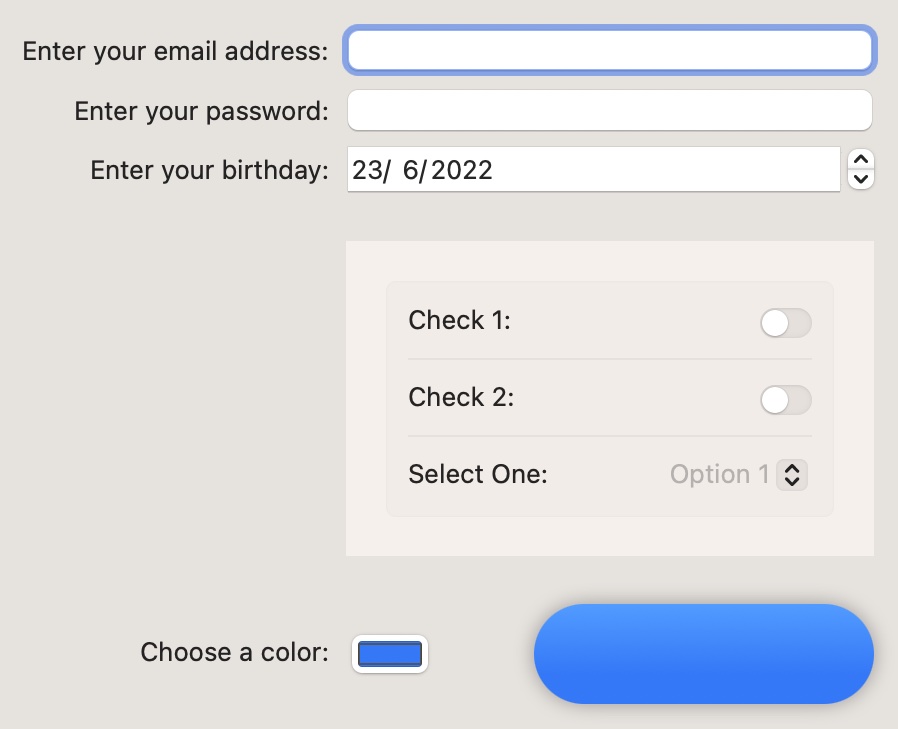
There are a few interesting things here. Firstly, I achieved something I was unable to do last time and that is to make the text edit field have focus when the view opens. This was a three part operation:
Firstly, I added this property to the view:
@FocusState private var emailFieldHasFocus: BoolThen, I added this modifier to the edit field:
TextField("Enter your email address", text: $email)
  .focused($emailFieldHasFocus)
And finally, I set the Boolean property in the onAppear modifier:
.onAppear {
  emailFieldHasFocus = true
}
With this in place, the email text entry field had the focus whenever this view appeared.
The date picker is slightly confused. It can't seem to decide whether it's a graphical picker or a numeric picker, but it works. I haven't tried the new date range picker yet.
With the check marks, I was trying to emulate the toggles in System Settings, where they are very small switches. I set the toggleStyle to switch which gave the right shape but it was big, like on an iPhone or iPad. The outermost form is set to use the columns formStyle. This lines up the labels and controls very neatly. But when I put the Toggles and Picker into an inner form with a style of grouped, I got the exact System Settings look I was going for.
As an aside, I love the way you can now apply control-specific modifiers to a container view and every appropriate view inside the container will use that setting. For example, I added .toggleStyle(.switch) to the Form view and it was applied to every Toggle inside it.
The final item in the form is a color picker. It opens up the standard macOS color picker and uses the selected color to fill the capsule beside it. The interesting thing is that the color has a gradient modifier. So you can see the faint gradient that is automatically applied to the shape.
Menu Bar Apps
Writing a menu bar app has previously required using AppKit to create a NSStatusItem. Now, we can add a MenuBarExtra scene to the app body to create a menu bar app component.
MenuBarExtra("HTTP Status Code", systemImage: "number.circle", isInserted: $showMenuBar) {
  MenuBarView(httpSections: $httpSections)
}
Setting the title without a systemImage shows the text as the menu bar title. when you specify a systemImage, the text is not displayed and the menu bar only shows the image.
MenuBarExtra takes an isInserted parameter, so you can turn it off and on. I added this to the app's settings and stored it using @AppStorage.
I set up a new SwiftUI view that looped through the HTTP Status data and created a submenu for each category and set this as the MenuBarExtra view. This works and my menu bar component was functional. Selecting a status uses NSWorkspace to open the relevant documentation page at MDN.
Conclusion
2022 is an exciting year to be a SwiftUI programmer. Apple has made it very clear that this is the way forward and as early adopters, we have the ability to influence how the framework develops, so keep filing those feedback reports! There have been some great new features this year: navigation is better than ever, the platforms are unifying and macOS is not getting left behind.
The project from this article is available on GitHub. And as usual, I'd be thrilled to hear any suggestions, corrections or improvements. Please contact me using one of the links below or through the Contact page. And if you found this article useful, I'd love you to buy me a coffee.