SwiftUI for Mac on Big Sur
8th July 2020 • 2,745 words • 13 minutes reading time.
In December 2019, I wrote a series of articles about using SwiftUI to build a Mac app. At WWDC 2020, Apple announced macOS 11 Big Sur along with Xcode 12 and a heap of new features for SwiftUI, so I decided to try creating my test app again and seeing how much had changed.
You can read the earlier articles and if you are interested, download the previous project from GitHub. Usually, when revisiting an old app, I would update the existing project, but this time I want to use the new SwiftUI App so I am going to start from scratch with a new app project, copying in code as required. And I plan to follow the same basic thread as I did in the previous articles. Who knows haw many parts this one will have!
For reference, I am running the beta of macOS 11 Big Sur (20A4299v) and the beta of Xcode 12 (12A6159) on a rather aged MacBook with a dodgy battery. I do not have Xcode 12 installed on my Catalina Mac, so I have no way of telling whether some of the oddities are due to Xcode or Big Sur but I will try to keep this article updated as the new betas improve things.
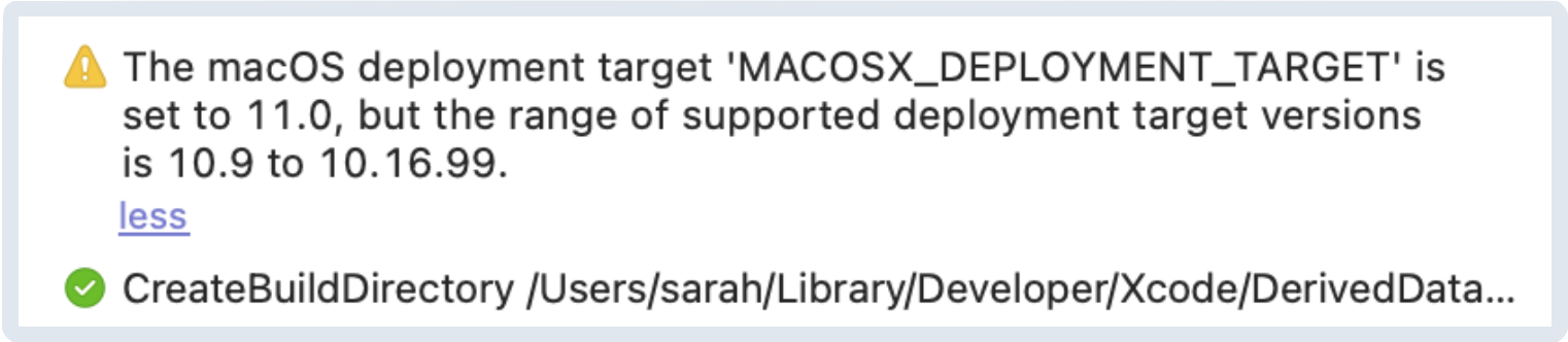
Update: I have downloaded macOS Big Sur beta 2 (20A4300b) and Xcode 12 beta 2, oddly labelled in the About box as 11.5 (11E608c). I have only found one thing that needs to be changed. I had set the deployment target to 11.0 but the new Xcode does not allow this as an option and the app fails to build. Change the deployment target to 10.16 to make it work.
It looks like Apple is having some problems with consistency in the new version numbers in both macOS and Xcode.
The New Project
As before, the first step was to create a new project in Xcode. I chose the macOS App template although the Multiplatform option was intriguing. When setting the options for the new app, I chose SwiftUI for the Interface, SwiftUI App for the Life Cycle and Swift (of course) for the language.
Once I had selected a save location and the project was open, I checked out the file structure. The main difference here was that there is no AppDelegate.swift file. Instead there is a file called "SwiftUI_Mac_11App.swift" where "SwiftUI_Mac_11" is the name of my app. This file is vastly simpler than the old AppDelegate but it sets up the app, the scene and the window group, with the expected ContentView as the main content.
ContentView.swift had a change too. Instead of setting the maxWidth and maxHeight of the view to .infinity, this Content View only adds some padding to the standard Text view. Time to see what happens when I run...
The first run took longer than I expected (I told you it was an old MacBook) but then a very small window appeared, just big enough to show the "Hello world!" text with its padding. The app has all the expected menus although I have no idea where they are set up.
Closing the app and using the Canvas preview worked much as before, although the canvas now has additional controls including a button to add another preview and a menu to configure each preview. Oddly, running the preview and clicking "Bring Forward" displayed two app windows. I presume this is an Xcode 12 beta "feature".
I used the attributes Inspector to edit the Text view, setting text, font style and weight and color. I had read that Xcode 12 had much better auto-formatting, but when adding modifiers this way, they all ended up on a single line which was not pretty. Manually adding line feeds before each dot did give a very neat structure, so typing in modifiers will be my preferred method.
Editing the Layout
Now on to my own layout. As I did last time, I used a static list to make a NavigationView for preliminary testing.
struct ContentView: View {
    var body: some View {
        NavigationView {
             List {
                 ForEach(1 ... 10, id: \.self) { index in
                     NavigationLink(destination: Text("\(index)")) {
                         Text("Link \(index)")
                     }
                 }
             }
        }
    }
}
When I ran the app or looked at it in the Canvas it looked great, but when I clicked a link in the sidebar, the window shrunk to an unusably small size. So I added a frame modifier to the destination view. And I also set the ListStyle to SidebarListStyle() which gave the new macOS 11 full height sidebar look.
But here is where I encountered the first major difference. When I selected an item in the sidebar, the app correctly showed the detail view. But if I put the app into the background, this detail view disappeared. It literally disappeared because I was able to track that it was calling its onDisappear modifier.
After a lot of testing, several days of frustration and help from Jordan Singer with his mail-swiftui-sample project, I was finally able to work this out. The difference is that the initial view has to specify what comes next as well as what it is displaying. So in the initial NavigationView, I had a List, but I also needed some view to show that I was going to show another view in another column. This second column view has to reserve the space for the detail view to come.
I have no idea how Jordan worked this out, but I am very grateful. What I ended up with was this:
struct ContentView: View {
    var body: some View {
        NavigationView {
            List {
                ForEach(1 ... 10, id: \.self) { index in
                    NavigationLink(destination:
                                    Text("\(index)")
                                    .frame(maxWidth: .infinity, maxHeight: .infinity)
                    ) {
                        Text("Link \(index)")
                    }
                }
            }
            .listStyle(SidebarListStyle())

            Text("Select a link...")
                .frame(maxWidth: .infinity, maxHeight: .infinity)
        }
        .frame(maxWidth: .infinity, maxHeight: .infinity)
    }
}
The "Select a link..." text is shown when there is no destination view to display. And when I click one of the entries in the sidebar, its content replaces that Text view but keeps its frame.
Displaying Data
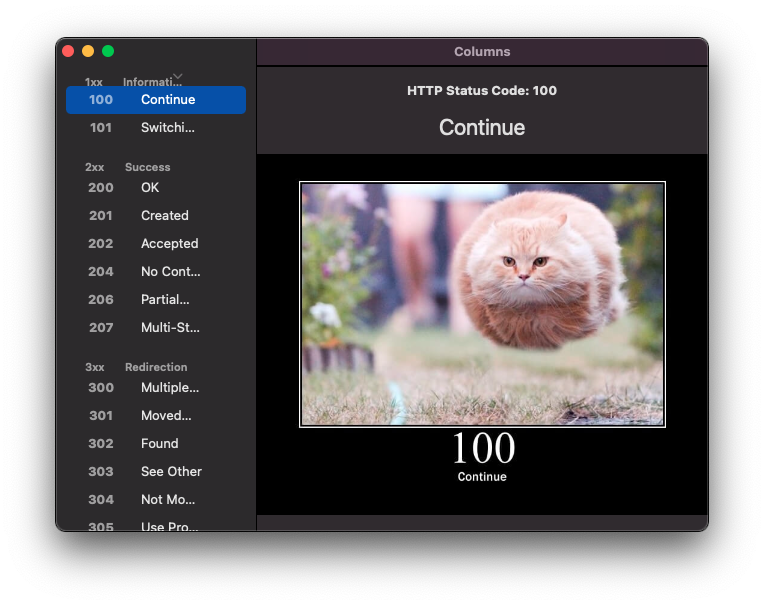
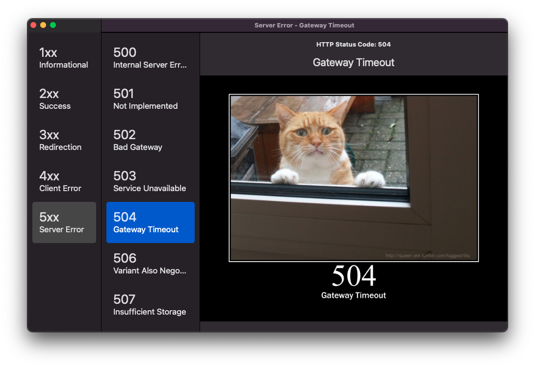
As with the previous app, I am displaying data from HTTP Cats. This part remains the same, so check back to the original article if you want to see how I did this. I did get warnings about the Decodable data structs I was using. My normal pattern when I want data to be Identifiable is to use something like this:
struct HttpSection: Identifiable, Decodable {
    let id = UUID()
    let headerCode: String
    let headerText: String
    let statuses: [HttpStatus]
}
But with Xcode 12, this gives an error. The error messages seem much more useful than before and they offered two suggestions. I tried what appeared to be the easier one of making the id mutable, but that stopped the decoding from working, so I added a CodingKeys enum to each struct to restrict the keys that would be included.
enum CodingKeys: String, CodingKey {
    case headerCode
    case headerText
    case statuses
}
When the app ran, I had a sidebar with collapsible sections. I wasn't that happy with the default look of the section headers and the disclosure marker for the first header was positioned beside the text instead of at the right, but I do like the selected item lozenge look. I set a frame height for the section header view and that made the spacing better but the disclosure mark for the first header was still incorrectly positioned.
The Detail view to be displayed when a status is selected had no major changes, so I dropped in the file from the previous app, without the extra bits to do with notifications and preferences. However since SwiftUI now includes a ProgressView, I swapped out my "Loading..." text for a indeterminate progress twirly.
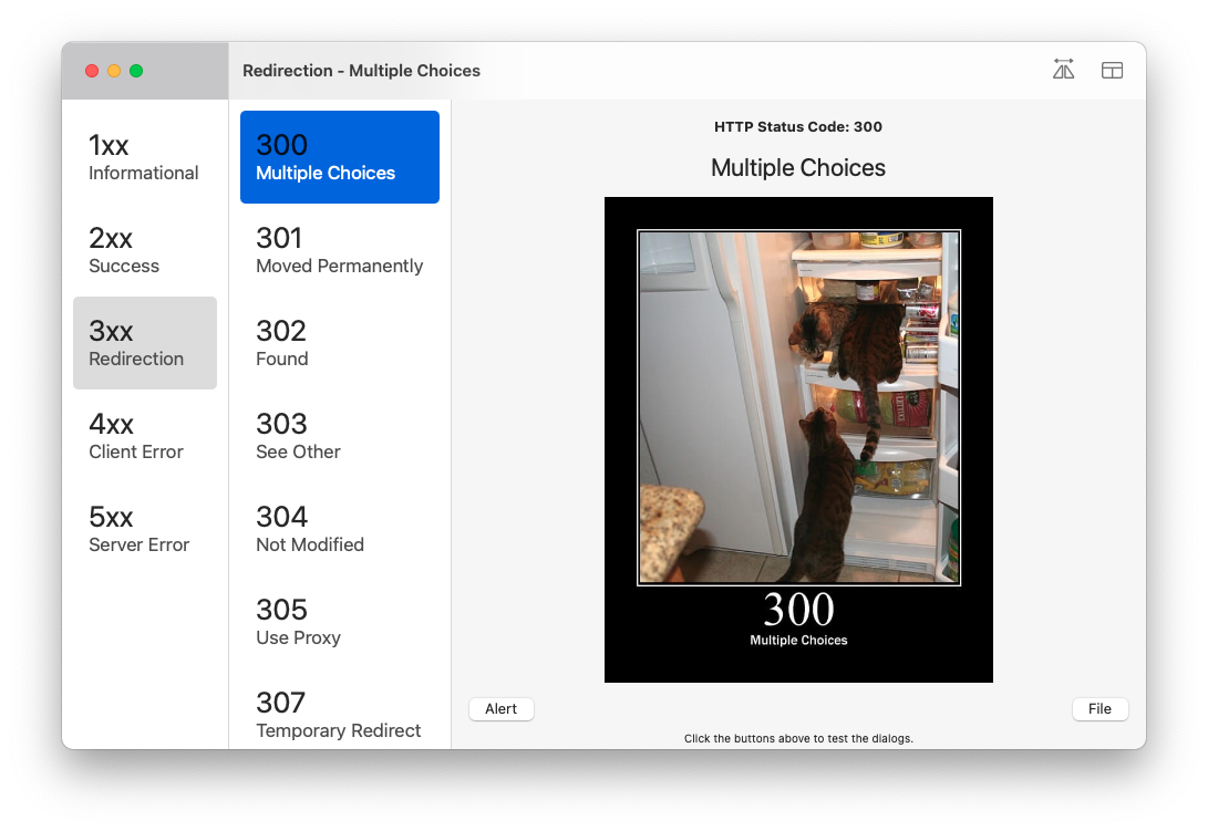
Three Column Layout
Since the collapsible sidebar wasn't looking good, I decide to try for a three column layout with the categories in the first column, the codes for the selected category in the second column and the detail view in the third column.
The way I implemented this was to have the first list only show the section headers with NavigationLinks to a sub menu. To reserve the column layout, I had an empty submenu after the main list.
In the second column, I showed the sub-headers with NavigationLinks to the DetailView. This view reserved the space for the third column with a Text view that changed its text depending on whether that submenu was displaying anything or not.
I expanded the menu items to be big and chunky, which I feel fits the new style. The only remaining problem was that with the primary list set to use SidebarListStyle(), it only ever showed the first item. I had to change this to InsetListStyle() to see all the items! This lost the full height sidebar effect, but I assume this is a temporary bug.
Menus
Now I had the layout equivalent to what I ended up with after part 1 of my original series, so it was time to explore menus, which are very different. In the old style SwiftUI apps which were wrapped in AppKit, the menus were in a storyboard that you could edit. Now you add commands to the app's WindowGroup to alter the menus.
The easiest way is to add a completely new menu, but it is also possible to insert new menu items after or before certain standard menu items.
Here is how to add a new Utilities menu with three items:
@main
struct SwiftUI_Mac_11App: App {
    var body: some Scene {
        WindowGroup {
            ContentView()
        }
        .commands {
            CommandMenu("Utilities") {
                Button(action: {}) {
                    Text("Dark mode")
                }

                Button(action: {}) {
                    Text("Light mode")
                }

                Button(action: {}) {
                    Text("System mode")
                }
            }
        }
    }
}
A CommandMenu adds a new menu and it is always positioned between the standard View and Window menus. To add items to an existing menu, you need to use a CommandGroup and tell it where to appear. It can be after or before various standard menu items. Look up the docs for CommandGroupPlacement to see which items you can use as positional markers. I used after .windowArrangement.
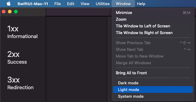
Weirdly, the font, color and spacing of these menu items was different to the standard menu items. I can only assume this is a bug which will be fixed. I faked the proper look with modifiers, but it didn't feel right. This screen shot shows the default look with the three mode items being my additions to the standard Window menu.
I tried using Labels to add an icon to the menu item. As I was switching between view modes, I wanted to have a checkmark before the selected menu item. This worked when first drawn, but the menus did not refresh when the data changed, so that was no use.
I also tested using Divider() to get a menu separator. It worked, but the look didn't match the standard dividers. So menus need a lot of work still...
I kept the technique of having menu items publish notifications that other views could pick up. This seems to work well. I would have liked to have certain menus or menu items only appear conditionally or perhaps enable/disable conditionally, but I could not see how to do that. Since menus do not appear to update when data changes, this may not be possible right now.
Preferences
There was one place where the new app architecture was amazingly good and that was to do with preferences. In my previous attempt at this app, I had a Preferences window and it was a major exercise to stop it opening more than once. This time, it was super easy. In the App.swift file, beside the WindowGroup, I added Settings which contained a view which had the UI for my app's preferences.
This caused a few errors at first, but I added a @SceneBuilder property wrapper to the App's body and that fixed the errors.
@main
struct SwiftUI_Mac_11App: App {
    @SceneBuilder var body: some Scene {
        WindowGroup {
            ContentView()
        }

        Settings {
            SettingsView()
        }
    }
}
These three lines of code added a Preferences menu item and hooked it up to my SettingsView. This view opens in a new window when the Preferences menu item or keyboard shortcut is used and only one copy of this window ever appears.
Then on to the second brilliant thing about preferences: @AppStorage. In the previous version, I used a custom property wrapper to wrap settings that I wanted saved into UserDefaults. This is now built into SwiftUI and this was all I had to do:
@AppStorage("showCopyright") var showCopyright: Bool = falseNow any time that variable was accessed, it was read from UserDefaults and every time it was changed, it was written back into UserDefaults. Instant preferences in a single line!
To pass this setting to a different view, all I had to do was give that view this same declaration. And it just worked!
Opening Another Window
Last time, I tried lots of different ways using hosting controllers, storyboards etc. to open secondary windows. This time I decided to stick to using sheet since it seems to be what works best for SwiftUI apps. So I added my User Interface Elements sample window as a sheet.
The view itself was reasonably similar except that last time, I used an NSViewRepresentable to embed an AppKit color well into the view. This time I was able to use the new SwiftUI ColorPicker which made it much easier to get the color back into the main view. I also added the new date and time pickers.
The color picker worked really well except that there is an option to specify whether the picker should support opacity or not. I found that no matter what I chose here, I never got the option to chose a color with opacity.
The date picker was good. It showed the date numerically using my local format - DD/MM/YYY. Clicking on any of the elements popped up a calendar view. The time picker was not so easy to use. Again, it showed the time in my format e.g. 7:53 pm. But there was no graphical entry, you click on an element (hour, minute or am/pm) and type. This would be OK except that every time you type, the focus jumps back to the hour. I found this confusing.
One big improvement is the ability to apply a keyboard shortcut to a button. When I set the keyboard shortcut for the Close button to .defaultAction, the button got the default appearance and was triggered by pressing the Return key.
    Button(action: {}) {
        Text("Close")
    }
    .keyboardShortcut(.defaultAction)
I was still unable to work out how to set the focus to a TextField. There are two new property wrappers to do with focus, but I understand they are not yet operational.
Dialogs
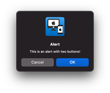
I have already used a sheet to display the UI elements and ActionSheets are not available on macOS, so that just leaves Alerts and file dialogs. File dialogs work identically in the app although they look quite different on Big Sur. Alerts look quite different but I think they are nice. Since the app icon is a prominent part of the dialog, I added one to make it look good. I understand that different numbers of buttons will get arranged in different ways.
Other Improvements
Self
Do a search for "self." and get rid of them all. Your code will be much cleaner and easier to read and SwiftUI now understands what you mean. If you want to read more details about this change, check out swift-evolution proposal SE-0269.
Navigation Titles
iOS had the concept of setting a navigation title but it didn't really work in macOS. Now you can set the navigationTitle of a view and this will be the window title.
Toolbars
This was an aspect of macOS apps that I referred to but didn't explore last time mainly because I assumed it would be done through the storyboard, just as with an AppKit app. Now we can add a .toolbar modifier to a view and have it include ToolbarItems. For the first time, we can now use SF Symbols in a macOS app, so that made it easy to add good looking toolbar items.
I would like to vary the toolbar according to what is being displayed, and the toolbar is also used to show the navigation title, but perhaps that is a topic for another day. There is certainly a lot to explore there.
Pyramid of Doom
With menus and toolbars, there is a heap of extra code added to certain views. I would love to be able to extract that into its own function or view modifier. I was able to extract the toolbar, but I am not sure how to do this with menus yet. I imagine it will need some specific sort of ViewBuilder but I think this is very necessary. Perhaps the topic for yet another article...
The project is available on GitHub. As always, if you have any comments, suggestions or ideas, I would love to hear from you. Please contact me using one of the links below or through my Contact page. Thanks for reading.
Thanks to Sungbin Jo (조성빈) for proof-reading and suggestions.