SwiftUI for Mac 2024
22nd August 2024 • 3,950 words • 19 minutes reading time.
Over the years, I have written articles and sample apps to demonstrate the new features of each year's SwiftUI updates with particular emphasis on macOS app development. Last year, the major update to SwiftUI was the new data flow system using the Observation framework. I covered that in my article SwiftUI Data Flow 2023 but I didn't feel there were sufficient UI changes to warrant an update to my usual sample app.
This year, the HTTP Cats app is back! And I'll cover new features from both WWDC 2023 and WWDC 2024.
It's currently August 2024 and I am running macOS Sequoia 15.1 Beta (24B5024e) with Xcode 16.1 beta (16B5001e).
Download the project from GitHub and, if you're running the correct versions of macOS and Xcode, you can run the app and follow along. If not, you can still look at the code, but it won't build.

Warning: there's a bug right now that crashes the app in macOS 15.1. If you scroll down the list in the sidebar and then select a status that is more than 8 or 9 rows below the previous selection, the app crashes with this error: Row index -1 out of row range (numberOfRows: 60). I've tested this with Xcode 16.0 beta 6 and Xcode 16.1 and they both act the same. But on a computer running macOS 15.0 beta 7 and Xcode 16.0 beta 6, it works perfectly. So this is a bug in macOS 15.1.
Here are the areas that I'm going to discuss:
Xcode
When you create a new project in Xcode 16.1, the second item in the project navigator is now a folder instead of a group. This sounds trivial, since it really is a folder in Finder but I find it really annoying because it doesn't allow me to arrange my other files and folders as I want them. To fix this, right-click on the folder and select Convert to Group. The icon switches from blue to gray and you can once again drag files and folders to re-order them.
The advantage to the folder option is that your project is read directly from the file system, so you can use Finder to move files around and Xcode will reflect the changes. To import a file into the project, you can drag it into the project's Finder window and Xcode will see it. Similarly, to delete a file, you can use Finder directly. With the group option, you have to import files into the Xcode Project navigator, and when you do, source control marks the .xcodeproj file as modified, making source control messier. Using the folder option, only the new file itself gets marked as a change. So use which option works for you, but I much prefer the clarity of being able to organize my files in the Project navigator.
The next thing to look at in Xcode is Predictive Code Completion. While the Xcode betas run on macOS Sonoma, predictive code completion requires Sequoia and I think it also requires a minimum of 16GB of memory. We don't yet have the promised Swift Assist which will allow for a more detailed way of asking Xcode to write code, but the code completion is supposed to be much better.
I've used GitHub Copilot for writing JavaScript for a couple of years now and overall, it works well. I use it as a form of super autocomplete and targeted search rather than asking it to write large chunks of code for me, and that's what I'm hoping to get for Swift now. Xcode has a way to go to catch up yet. Surprisingly, it suffers from one of the same problems as Copilot - it appears to have been trained on old code!
I know some people are very negative about using any form of AI to write parts of your code, but I see it as just another tool to help us be more efficient. For example, I bet you've written code to download and process JSON many, many times. Why not let Xcode write that for you? You still have to do the thinking. What's the URL? Which properties do I need? How am I going to use the data? But you don't have to write the boilerplate. It's no different to using a library or a pre-built function.
I put predictive code completion to the test by creating a new Swift file called Networker.swift. I set up a Networker class and gave it a web address. Then I started to write a function to fetch the data:
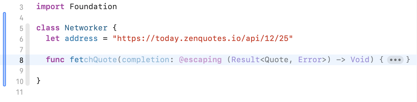
The faded text is the suggestion. I had only typed func fet. It used the address to deduce that I was downloading quotes - not unreasonable. I pressed Tab to accept and got the next chunk:
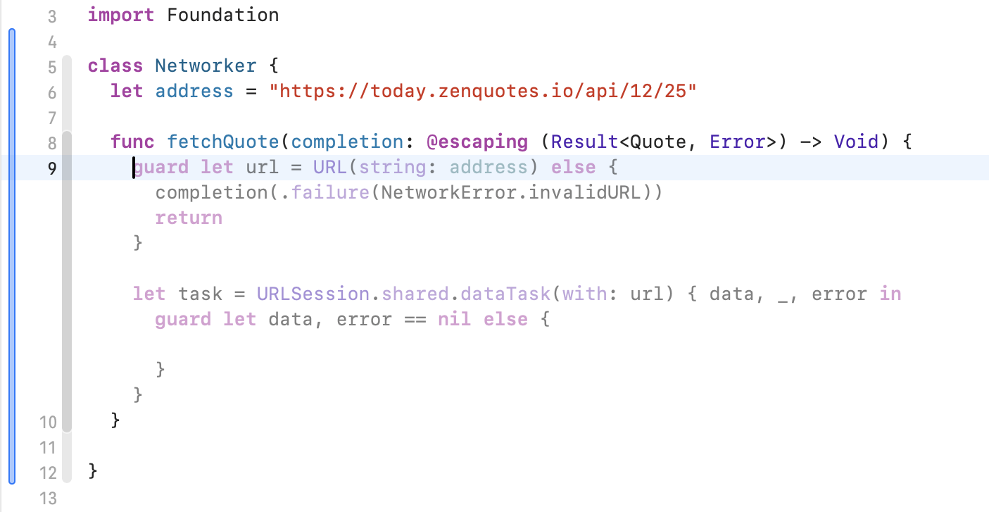
After pressing Tab a few more times, I ended up with this:
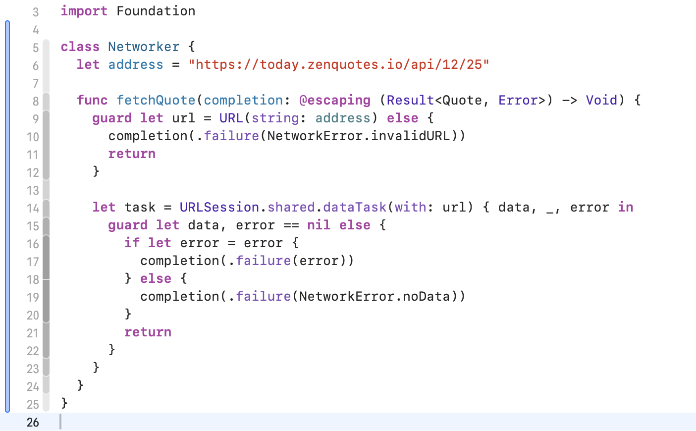
This doesn't build and it uses old-style completion handlers instead of async/await. The biggest problem I see is that it's fallen into the usual URLSession trap and not called resume on the task. So this was never going to download anything.
I started to define a NetworkError enum and it filled in the cases it had used, so that was really good. When I started to define a Quote struct, it also added some reasonable properties, as well as marking it as conforming to Codable - bonus points there.
When I tried to build, I got sensible warnings pointing out that I had not used either task or data. This would have reminded me to call resume if I hadn't already noticed. I also got a Swift 6 concurrency warning about the completion handler.
So overall, not great yet. Old technology and a flawed implementation. One of the points Apple people made at WWDC 2024 was that these code tools would be trained on the latest Apple APIs. This is not the case here, but I'm still running a beta, so I'll give them the benefit of the doubt for now. I'll definitely be keeping an eye on this feature and hope to be able to make good use of it in the future.
Before I move on from Xcode, there's one more feature I want to mention and that's the new options for creating a new file. If you press Command-N, you get the file template chooser, just as before. But now there are other possibilities. You can use the File menu or right-click in the Project navigator to add a new empty file, but the one I like best is the ability to make new files from the clipboard. I don't know about you, but when I'm working on a SwiftUI project, I'll often have more than one view in a file, especially if I've created views by extracting subviews. Later on, I'll want the view to have its own file.
I had a view called MeshBackground which didn't have its own file, so I selected the entire struct and pressed Command-X to cut it out. Then both the contextual menu and the File -> New menu offered New "Meshbackground.swift" from Clipboard. When I selected this, it added the file, named it and pasted in my struct. The only thing I had to do was to add the import SwiftUI statement at the top of the new file. I think it could have been smart enough to work this one out, but maybe later.
This is a great time-saver and will really encourage me to keep my code well-structured.
In minor Xcode updates over the last two years, my favorite feature is using Control-M to split long lines of code over multiple lines.
Previews
Last year, we got the #Preview macro which made SwiftUI previews a lot neater. We went from:
struct SidebarRowView_Previews: PreviewProvider {
  static var previews: some View {
    SidebarRowView(code: "418", title: "I'm a teapot")
  }
}
To this:
#Preview {
  SidebarRowView(code: "418", title: "I'm a teapot")
}
Xcode 15 has a converter you could use to switch to the new format, and Xcode 16.0 still has it but Xcode 16.1 does not. I'm not sure why they removed it, but it's not a big deal to do it manually.
The new thing this year in previews is the @Previewable macro which lets us provide data to a preview. This is especially useful for binding properties. In SidebarView.swift in the sample app, I show the old style commented out:
SidebarView(httpSections: HttpSection.localData, selectedStatus: .constant(nil))selectedStatus is a Binding, so I can't just pass in nil. I had to use .constant to create a Binding set to nil. With @Previewable, I can do this:
@Previewable @State var selectedStatus: HttpStatus? = nil
SidebarView(httpSections: HttpSection.localData, selectedStatus: $selectedStatus)
I expected to be able to supply an actual HttpStatus here and have it start as the selected item in the list, but although it compiled fine, it didn't show up as selected in the preview initially. But I am now able to change the selection in the preview.
Windows
The first window feature I want to address is not new, but I've been asked about it a few times. How do you make a single window app and get SwiftUI to remove the File -> New Window menu item?
When you create a new SwiftUI app, the ...App.swift file contains something like this:
@main
struct NewApp: App {
  var body: some Scene {
    WindowGroup {
      ContentView()
    }
  }
}
This defines the main scene of the app as a window group which allows for multiple identical but independent windows. You get a File menu with a New Window item and a Close item. If you want a single window app, you need to change the WindowGroup to a Window, supplying the window title and an id string:
@main
struct NewApp: App {
  var body: some Scene {
    Window("New App", id: "mainWindow") {
      ContentView()
    }
  }
}
The id can be anything so long as you don't use it for any other window in your app. In the default state, this removes the File menu completely. It also changes the app behavior so that closing the window quits the app completely. If you add any new commands to the File menu, you'll get the Close item back, but using it will still quit the app. You can still open secondary windows in this style of app, but you can't duplicate the initial window.
I covered how to open new windows in my previous article SwiftUI for Mac 2022. The code is still present in this year's sample app for reference, but commented out.
There is a new window scene called UtilityWindow. This is primarily intended for floating palettes and toolbars. I've used it for the UI Samples window just because that was a window I wanted to show, but it's not really the right design choice for this sort of informational window.
In SwiftUI_Mac_2024App.swift, here's how I set up the utility window:
UtilityWindow("UI Samples", id: "ui_samples") {
  SamplesView()
}
.keyboardShortcut("u")
Similarly to Window, it needs a window title and an id. The view to show in the window is in the closure and I've added an optional keyboard shortcut.
If you add a Window scene that's not the initial window, it appears in the Window menu and you can open it from there with an optional keyboard shortcut. A UtilityWindow gets a Show/Hide menu item in the View menu instead, and the keyboard shortcut toggles it.
A utility window has a few other differences:
- It's a floating window that appears above your other windows.
- It doesn't get focus by default when opened, you have to click in it to make it active.
- When focused, you can close it with the Escape key.
- It's hidden when your app is no longer the active app.
- It cannot be minimized, so the orange button in the title bar is disabled.
These windows can be opened programmatically in exactly the same way as other windows, using openWindow. Check out the code in ToolbarView.swift to see how I do this.
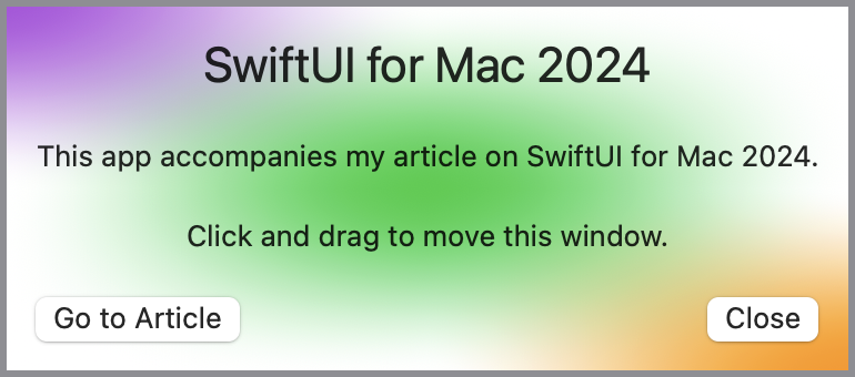
The other window features I want to explore relate to style, initial position, and dragging. In one of the WWDC 2024 videos, the presenters created a custom About window for their app, so I decided to try to do the same.
First I made a SwiftUI view called AboutView. I added some titles and buttons, including one to close the window. I also added a mesh gradient background to make it look a bit more interesting. See the Colors and gradients section below for more info on that.
With the view created, now I had to work out how to show it instead of the default About window. I started by adding a new window scene to SwiftUI_Mac_2024App.swift:
Window("About", id: "about") {
  AboutView()
}
Then in MenuView.swift, I added a new CommandGroup, replacing the existing appInfo command:
CommandGroup(replacing: .appInfo) {
  Button("About SwiftUI Mac 2024") {
    openWindow(id: "about")
  }
}
When testing this, there were two problems:
- The window was too large for my content.
- There was now an About menu item in the Window menu as well as About SwiftUI Mac 2024 in the app menu.
To fix these issues, I added modifiers to the window scene:
.windowResizability(.contentSize)
.commandsRemoved()
Now my content filled the window although the sizing could still be too small or too big. But the Window -> About menu item was gone, so I was making progress.
Next up is the new defaultWindowPlacement modifier, which lets you set the initial position and size of a window. I added this to the About window scene:
.defaultWindowPlacement { content, context in
  let displayBounds = context.defaultDisplay.bounds
  let contentSize = content.sizeThatFits(.unspecified)
  let position = CGPoint(
    x: displayBounds.midX - (contentSize.width / 2),
    y: displayBounds.midY - (contentSize.height / 2)
  )
  return WindowPlacement(position, size: contentSize)
}
The context is a WindowPlacementContext that provides the display where the window will appear. I'm using its bounds to determine the screen size.
The content is a WindowLayoutRoot that gives the sizeThatFits for the proposed content allowing for various proposed view sizes. I'm using the unspecified size to get the ideal size for the content.
With these two pieces of data, I can calculate the position for the top left of the window so that the center of the window will be at the center of the screen, and combine this with the size into a WindowPlacement.
Now when I run the app and open the About box, it's in the center of the screen and the right size for the content. But if I move the window, then the next time I run the app, it's where I put it instead of in the center. This is the correct behavior for most windows, but not for the About window. I want it to be centered every time.
Time for another modifier:
.restorationBehavior(.disabled)This stops the window from remembering where it was put when the app re-launches. It remembers inside a single launch, but not on the next launch. If your window still remembers where it was because you moved it before adding this modifier, you may need to delete the app's container folder in the Library/Containers folder to reset it.
One thing I noticed was that this always put the About box on my primary monitor, even if the app was running on a secondary monitor. If I re-enable the restoration behavior, the window appears on the correct monitor, but then it doesn't center.
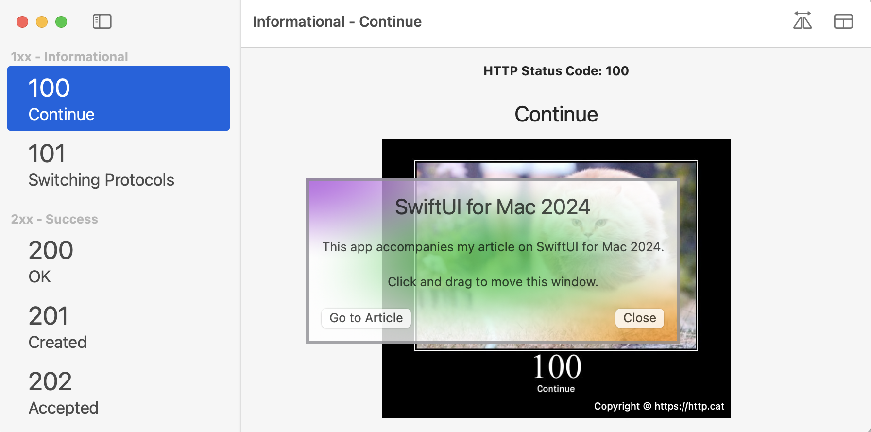
Now I have two more requirements: I want the About window to have no title bar and I want to be able to drag it around the screen by clicking anywhere in the window. The first part is accomplished with yet another modifier:
.windowStyle(.plain)Now the window has no title bar. Good thing I added a Close button! One annoying bug is that I added a keyboard shortcut to the Close button so I could use Escape to close the window. With a plain window style, it no longer works. The console shows this: Warning: -[NSWindow makeKeyWindow] called on SwiftUI.AppKitWindow 0x139365800 which returned NO from -[NSWindow canBecomeKeyWindow], so I guess the plain styled window is unable to become the key window and so cannot detect keyboard events.
For the dragging, open AboutView.swift itself. The simplest way to achieve the required result is to add this modifier to the main VStack:
.gesture(WindowDragGesture())Now I can drag the window around by pressing and dragging from anywhere in the window. But I want more! I want to be able to track when the window is being dragged so I can change it visually. WindowDragGesture is new but it conforms to the Gesture protocol so I can use it to detect the state of the drag. I added an @GestureState property to AboutView to track it:
@GestureState var isDraggingWindow = falseThen I created a new WindowDragGesture with an updating closure to set the gesture state to true during a drag operation:
var dragWindow: some Gesture {
  WindowDragGesture()
    .updating($isDraggingWindow) { _, state, _ in
      state = true
    }
}
Finally, I changed the gesture modifier to use this:
.gesture(dragWindow)Now that I have a property to track the dragging, I added a modifier to the VStack to change the opacity while the window is being dragged:
.opacity(isDraggingWindow ? 0.8 : 1)And after all this, I finally had what I wanted:
One final tweak would be to show an appropriate cursor when the window is being dragged. I tried adding to the dragWindow gesture, but in the end I switched to using an onChange modifier:
.onChange(of: isDraggingWindow) {
  if isDraggingWindow {
    NSCursor.closedHand.push()
  } else {
    NSCursor.pop()
  }
}
Tabs
The syntax for defining tabs got what appears to be quite a minor upgrade, but it feels so much better. Here's the old syntax:
TabView {
  ChartSamplesView().tabItem {
    Text("Chart")
  }
  FormSamplesView().tabItem {
    Text("Form")
  }
}
This always felt backwards to me. The label of the tab is in the closure and the view that's inside the tab comes first, with a tabItem modifier.
The same tab view now looks like this:
TabView {
  Tab("Chart", systemImage: "chart.bar.doc.horizontal") {
    ChartSamplesView()
  }
  Tab("Form", systemImage: "list.bullet.clipboard") {
    FormSamplesView()
  }
}
This suits my brain much better. I define a tab first and then use the closure to say what it will show. The only issue I have with this is that it has not considered Mac tabs which are mostly text only. You must specify an image for the tab, even when it won't appear. In an app's Settings view, the tabs are styled differently and will show an image, but not in a conventional Mac window.
Ok, the image can appear in a conventional Mac window if you style the tab view differently. If you add a .tabViewStyle modifier to a tab view, you can set it to either automatic, grouped, sidebarAdaptable or tabBarOnly. The default is automatic, which is tabBarOnly on macOS. The grouped option is marked as being in beta, but it looks very familiar. It moves the tabs down so they are more like part of the content. The new one is sidebarAdaptable which moves the tabs to the sidebar and shows the images. I can't see myself using this in a Mac app, I think it's designed more for the other OSes. It would only be useful if you had a long list of tabs that wouldn't fit horizontally.
In the sample app, open SamplesView.swift and test the different tab styles to see what you think. I've added the two non-standard options there commented out so you can try them in the preview.
Charts
Last year, Swift Charts got a pie or donut option. This year, the charts team added vector and function plotting. In ChartSamplesView.swift, I have three different charts: a bar chart as before, a pie chart and a line chart that plots various sine waves. My understanding is that the various plot types are great for functions or for large data sets but for more comprehensive information, check out the WWDC presentation: Swift Charts: Vectorized and function plots.
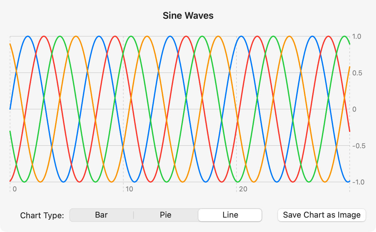
In my samples, I have a separate computed property for each of the three chart types, with a @ViewBuilder property to return the correct chart. I've also updated the chart image export to use SwiftUI's fileExporter instead of the AppKit's NSSave. I had a slight issue with fileExporter. I started off by including the image content type when configuring the exporter. This gave generic error when I tried to save - not the most helpful of messages. I removed the content type and it worked fine. I'm not sure if this is a bug or a feature.
Colors and gradients
When you specify a Color in SwiftUI, you have the ability to add a standard gradient:
Capsule()
  .fill(.orange.gradient)
This is a great modifier as it gives us a very simple way to improve the look of a flat block of color.
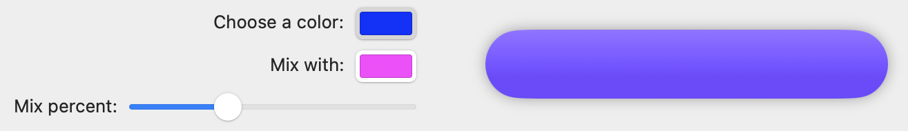
This year, we also get the ability to mix colors, like this:
Capsule()
  .fill(
    selectedColor
      .mix(with: mixColor, by: mixPercent)
      .gradient
  )
Open the UI Samples window and go to the Form tab to test out some color mixes. This not only allows us to create our own colors, but it also gives us a way to change colors programmatically like I do with the slider in the example. You can even chain mix modifiers for more variability.
The other big new thing is mesh gradients. As you saw in the Windows section above, I used a mesh gradient to create a background for the About window. The basic technique for creating a mesh gradient is to make a grid of points and assign a color to each point. The points are defined as SIMD2<Float> so you initialize each point with SIMD2(x, y). Then you supply an array of colors for each point. The colors expand out from each point, meshing with their neighbors.
In my example, I set most of the colors to white but changed the top left, middle and bottom right points to different colors so that I got a diagonal gradient. I also used even spacing for the points, which is not necessary. Check out the code in MeshBackground.swift to see how I did this.
If you want to know more about mesh gradients, I highly recommend Stewart Lynch's video: MeshGradients in iOS 18 and Xcode 15. Although the title says iOS 18, it's all valid for macOS 15 too.
SF Symbols
My final topic is the ability to add animated effects to SF Symbols. You can test this in the FormSamplesView.swift preview, which only works because I used @Previewable to add the menu selection to the preview. Before that, the preview worked but ignored any menu changes. The demo is a bit strange because it will often show the previous animation before using the new one, but this is not the way I would use these effects in an app and it does allow you to see what's happening. Just keep clicking Show Effect to see your selected animation.
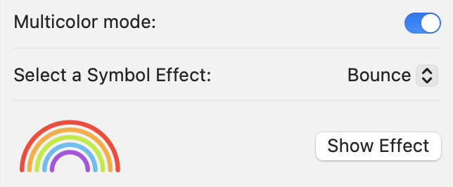
I wasn't able to get the appear or scale effects to work, but maybe that's an Xcode beta issue. They work in the SF Symbols app. The syntax for applying an effect looks like this:
Image(systemName: "rainbow")
  .font(.system(size: 50))
  .symbolEffect(.bounce, value: showEffect)
Specify a symbol as usual, sizing it as needed. Then add the symbolEffect modifier with the effect you want and a value. The effect is triggered whenever the value changes.
Conclusion
So those are my favorite SwiftUI additions from WWDC 2024. As we have seen in recent years, Apple is gradually converging the OSes, especially with SwiftUI, which means that a lot of code is no longer platform-specific. But as developers, we still have the responsibility to make our apps look, feel and behave in a way that suits the platform, whatever it is.
One other point is that a lot of resources will state that they are for iOS, but many of them are totally valid for macOS too. Don't skip an article or video just because it doesn't label itself as specifically for macOS.
If you want more Mac-specific content, check out my recently updated book: macOS by Tutorials. It's designed to help iOS developers extend into macOS development.
The project from this article is available on GitHub. And as usual, I'd be thrilled to hear any suggestions, corrections or improvements. Please contact me using one of the links below or through the Contact page. And if you found this article useful, I'd love you to buy me a coffee.