Name This App
9th May 2020 • 1,940 words • 9 minutes reading time.
My current work in progress is an iPhone app designed to make it easier to solve crossword anagrams by emulating and improving upon an ability that was there when we used to do crosswords on paper, but is missing for digital crosswords.
But I cannot think of a clever name for the app, so please read the story and contact me with your name suggestions or if you would like to test the pre-release version of this app.
Cryptic Crosswords
Programmers are basically puzzlers, and programming is the world's best type of puzzle, but I like to start my day with a cryptic crossword. Like programming, cryptic crossword clues have their own syntax and what seems like gibberish on a first glance, can be parsed into logical parts to take you to the answer. But there are aspects of solving crosswords that were easier with pencil and paper, so I decided to write an app to help fill one of those gaps.
My crossword of choice is the Crosaire crossword from The Irish Times. A lot of newspapers have a cryptic crossword and most of them need a subscription, but the Irish Times has a crossword only subscription that I really like. Crosswords also tend to require some local knowledge, but for the Crosaire, if you remember that the Abbey and the Gate are both theatres and that Down is a county, you will have most of what you need. And as an added bonus, the crossword creator later blogs the solutions with explanations so you can learn how the clues were constructed if you are totally mystified.
Anagrams
Anagrams are a very popular clue type but they can be tricky to solve because our brains are too good at discerning patterns. We can recognize words using only the first and last letters if they have the correct number of letters inside. This means that asking our brains to scramble these letters into a completely different word is very difficult. In the olden days, when I used to do crosswords in the newspaper, the best method was to find a space in the margin and write the letters out in a circle which forced my brain to reconsider the options.
Here is an example from a recent Crosaire:
Users rip off revelation (8)
The word "off" is a hint that this is an anagram, "Users rip" has the right number of letters, so the overall clue must be "revelation". This is not a very long anagram and I think having two words makes it easier, but lets take a look at how I would solve this the old-fashioned way. (And I knew the "I" was the third last letter.)

If you watch this gif and then look at it when it stops repeating, hopefully you will be able to see that the answer is "SURPRISE". Refresh the page if you want to start the gif looping again.
But I do crosswords on my iPad now and while I could use a notes app and my Apple Pencil to draw the letters out like I did in the GIF above, I don't always have the Pencil with me and I want to keep looking at the crossword. So I decided that a companion iPhone app was the way that would work best for me.
There are sites and apps that offer anagram solvers, but they are just looking through a dictionary and showing you all the possibilities. To me, this feels like cheating, but I don't have a problem with using an app to emulate the techniques I used to use with pencil and paper.
App Design
So I planned out the basic features of the app:
- enter a word
- display the letters in a circle
- shuffle these letters if needed
- place letters in a possible solution
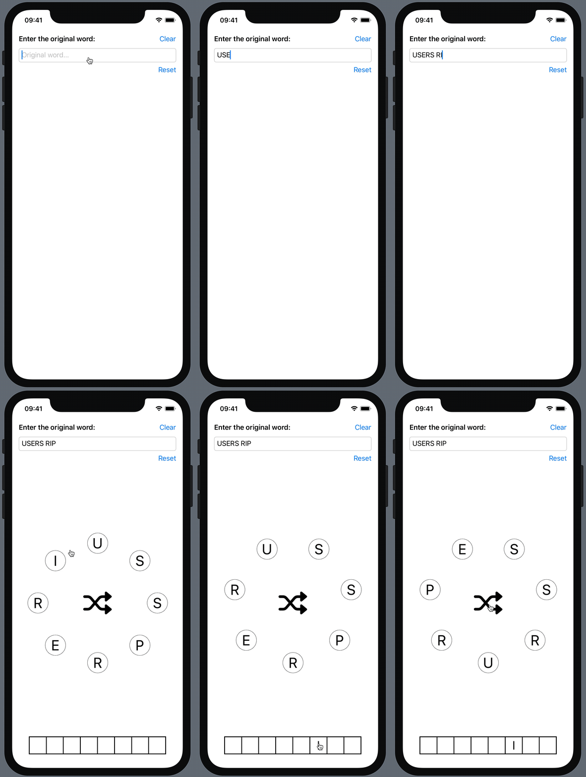
Arranging the letters in a circle was made relatively easy by using SwiftUI. I placed the letters in a ZStack so they were all piled on the one spot. Then I calculated the X & Y offsets needed to move each letter to the edge of a circle. This involving digging out some long-forgotten trigonometry to convert from polar coordinates to rectangular coordinates. I could calculate the radius of the letter circle based on the screen size and the angle between each letter was 360 degrees divided by the number of letters. So some quick calculations converted these two numbers into X & Y coordinates for each letter, and then I had my circle.
    var radiansBetweenLetters: Double {
        let degrees = 360.0 / Double(anagramLetters.count)
        let radians = degrees * .pi / 180
        return radians
    }

    var radiusForCircle: Double {
        let screenWidth = UIScreen.main.bounds.width
        return Double(screenWidth * 0.35)
    }

    func XoffsetForLetterAt(index: Int) -> CGFloat {
        // x = R cos t
        let totalRadians = radiansBetweenLetters * Double(index)
        let x = radiusForCircle * sin(totalRadians)
        return CGFloat(x)
    }

    func YoffsetForLetterAt(index: Int) -> CGFloat {
        // y = R sin t
        let totalRadians = radiansBetweenLetters * Double(index)
        let y = radiusForCircle * cos(totalRadians)
        return CGFloat(y)
    }
The original word was converted into an array for display, so re-arranging the letters was a matter of calling shuffle() on the array which automatically triggered a SwiftUI redraw.
And here is version 1 of the interface running in the SwiftUI Canvas:

Refresh the page to see the gif play, if it has stopped.
A Different Type of Anagram
Now we come to a variation of the anagram clue that is very popular with the author of the Crosaire crossword. I don't know if there is an official name, but I call them "subtraction anagrams".
Here is an example:
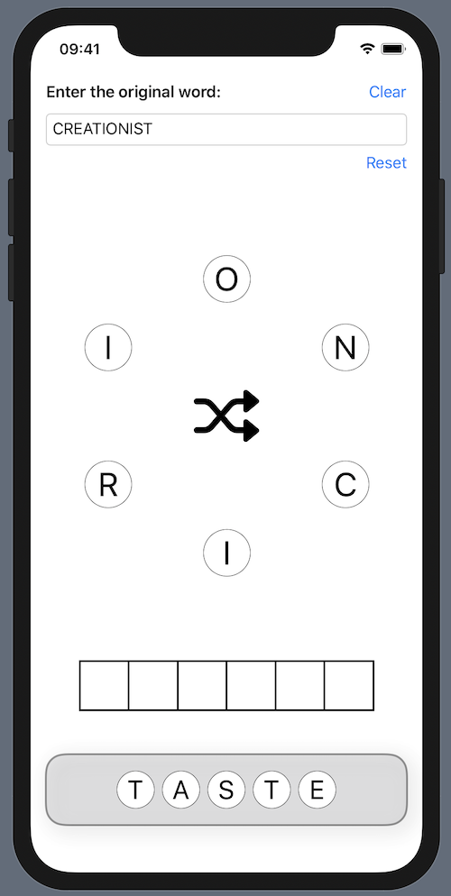
Creationist has no taste for what's sarcastic (6)
The idea here is to remove the letters in "taste" from the letters in "Creationist" and then unscramble the remaining letters to find a word that means "sarcastic". My first attempt at this used a Trash can button that removed the letter and shortened the space for the solution, but then I decided to have a discard tray at the bottom of the screen to show what had been removed and allow replacing any letters discarded by mistake.

After this, I added a bit of style to make it look nicer and then moved on to the next feature. If I knew some of the cross letters already, I wanted to be able to place them in the solution squares and then lock them in place. This would allow me to shuffle in letters to test and remove all the unlocked ones with a button click. So here is what the app looked like after those changes:
Refresh the page to see the gif play, if it has stopped.
Drag & Drop
My next experiment was with drag & drop to place or discard letters. I waited until iOS 13.4 brought drag & drop to SwiftUI but I was not happy with the result. Firstly, there is a big lag on dragging. You have to hold your finger down on a letter for quite a while before it becomes draggable. This was so counter-intuitive that I thought it wasn't working, but occasionally it did work and so I eventually deduced that it was a timing issue.
The second problem was solved thanks to a suggestion by Luis Ramos on Twitter. When I dragged a letter, the drag preview image was the shuffle button from the middle of the ZStack instead of the selected letter. This was solved by moving the onDrag modifier to BEFORE the offset modifier (not AFTER like I said in my original response to Luis). But I was still not happy with it, so I decided to discard this idea and stick to tapping.
There was one side-effect: I wasn't able to get the drag preview to be round - it was a square with opaque corners. As a work-around, I changed the letters to be inside squares and then decided this was a better look anyway, since it was more like what you see in a crossword.
Further UI Enhancements
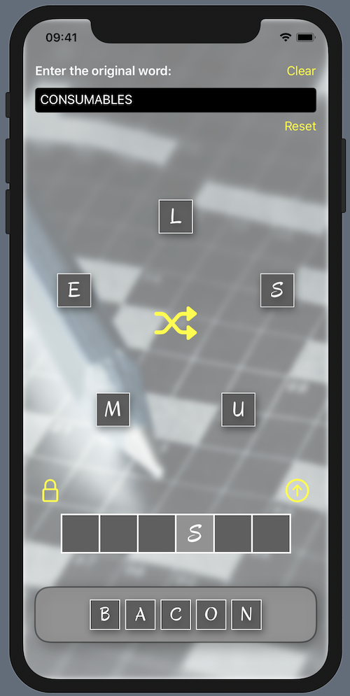
I installed a custom font so that it looked more like hand-writing. I wrote about installing custom fonts in a separate article, so if you are interested check that out for details on the multiple steps that you need to take to get them to work. I went through a few different fonts until I found one that I thought worked well and clearly for all the upper case letters but I settled on Oregano. And then I made the app work in dark mode too:

The clue for this one is "Consumables minus bacon and shellfish (6)"
Animations
SwiftUI has animation built in, so I was able to add an animation modifier to the various views to make the transitions look smooth. I particularly liked the way the letters re-arranged themselves around the circle when I removed or replaced a letter.
But to add something extra, I thought it would be fun if the letters all started in the middle and moved outwards to their places on the circle. The way I did this was by using a Boolean to store whether the letters had had their first draw. If not, the radius of the circle was zero, so they all piled in the middle. After a delay, this Boolean was toggled so the radius was changed to the full size and the animation modifier already applied, made the letters smoothly expand outwards.
For the letter shuffle, I did the reverse, moving the letters in, shuffling, then moving them out again.
Refresh the page to see the gif play, if it has stopped.
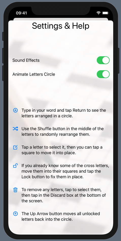
I also added sound effects and a slide-up sheet view with settings and help. I enjoyed using Apple's SF Symbols to show icons for each paragraph of the help, although I may change the colour of these icons as they look at bit too much like buttons right now.

Next Steps
Well, I am hoping that someone will come up with a good name. I thought of "Anagram Assistant" but that doesn't fit underneath the home screen icon and it was shortened to "Anagram". I don't want people to see it and think it is just one of those dictionary lookup anagram finders, so I would like something more descriptive while still being short, or at least having a short variant.
In honour of P.G.Wodehouse's favourite crossword clue, I thought of calling it "E blank U" but that isn't an anagram, so it doesn't really work. For people not familiar with that reference, Wodehouse's less quick-witted characters always get stuck on "Large flightless Australian bird, 3 letters. E blank U".
A clever name would be good - perhaps an anagram itself? If you think of anything, please let me know on Twitter, by using the email link below or through the Contact page. The namer will get full credit in the app. And use one of those methods to contact me if you would like to test the app before it is released.
Once I have a name, I can get to work on the usual secondary tasks which take so much time: App Store set up, screen shots, a support page and so on.
I haven't tried an iPad version yet. I got stung once by testing an iPad version of an app, deciding it didn't work well and then running into Apple's ban on dropping a platform from a published app. This has discouraged me from iPad apps ever since, which I doubt was their intention.
And if you are curious about the solutions to the clues I used in the examples:
Users rip off revelation (8) = SURPRISE
Creationist has no taste for what's sarcastic (6) = IRONIC
Consumables minus bacon and shellfish (6) = MUSSEL

