My First Apple Watch App
2nd April 2015 • 1,075 words • 5 minutes reading time.
I have just submitted my first Apple Watch app to the iTunes App Store. This is a scary thing to do, since I have never seen, touched or used an Apple Watch and all I had to go on was the Simulator that Apple supplies with Xcode.
At the moment, Apple has only made a limited set of Apple Watch features available to developers, and all Apple Watch apps come tethered to an iOS app - presumably this will mainly be iPhone apps, but I wonder will we be able to connect Apple Watches to iPads? Anyway, it made sense to extend one of my existing apps to use the Apple Watch instead of starting from scratch.
Of my iOS apps, I decided that The 19th Hole, my golf scoring app, would be well suited to the Apple Watch. The problem with using the iPhone version to score is that you have to keep pulling your iPhone in and out of your golf bag, sometimes in the rain, sometimes in bright sunlight. Being able to enter the scores on your wrist sounds like a big improvement. We know that the Apple Watch is at least somewhat water-resistant, but we are yet to see how well it performs in bright sunlight, however I would expect that Apple has put considerable effort into this.
Once I decided to write an Apple Watch app, the first step was to learn how. I read all Apple's published documents to get a feel for what was possible and what user-interface objects would be available. I find online courses very helpful and by far the best Apple Watch course that I found was Ray Wenderlich's WatchKit video tutorial series. The instructors were very clear and explained how the layout and sizing of objects works on the Apple Watch, as well as how to set up and move between views and how to communicate from the Watch back to the iPhone. The layout section of the course was particularly valuable as no other course I found even mentioned this, although it is crucial to the interface design and allowing for the two sizes of watch.
I had released an update to The 19th Hole recently in preparation for this. I wanted to have squashed the bugs and updated the interface, so the only changes needed would be the WatchKit ones.
The first step in adding a WatchKit app to your existing app is to create a new target in the Xcode project. Choosing WatchKit actually adds two new targets: the WatchKit Extension which lives on the iPhone and supplies the code for the Watch, and the WatchKit App which lives on the Watch and provides the interface.
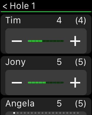
I decided to use a paged interface with one page per hole. Each of these pages has a table, with one row per player. A slider with plus & minus buttons lets you enter the score for each player and the total score for each player is also displayed.

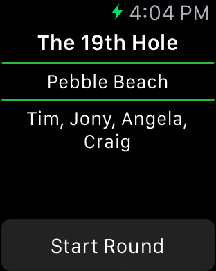
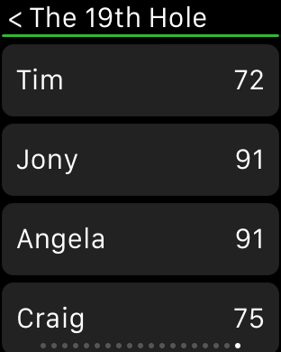
Apart from this data entry view, I have a splash screen which shows you the current round as set up on the iPhone and a final summary screen showing everyone's totals.


These images are taken from the Apple Watch simulator running in 42mm mode.
The biggest programming problem was getting the communications working beween the two devices. The 19th Hole uses Core Data for all data storage. My first attempt shared this data between the two apps, allowing both to read and update the database. This almost worked, but if both apps were open, then changes in one device did not get across to the other. It seemed that the data was cached and I was unable to find a way to force either app to update every time.
My next attempt kept all the data in the iPhone app and had the WatchKit extension ask for whatever data it needed and send changes to the iPhone app. This worked much better and I was able to get live updates between the two devices.
The other issue is the fact that I have never seen, touched or used an Apple Watch. This means that I had to guess a lot of things:
- how well will it perform?
- will the icon look OK?
- are the controls large enough to use?
- will the text be large enough to read?
My main philosophy was to keep the Watch app as simple as possible and use the standard interface elements, font sizes etc. Hopefully that will work.
The final step was submitting the app to iTunes Connect for review. It was not clear to me how to do this, so I logged into iTunes Connect, created a new version and entered the meta-data. I couldn't see anywhere to say anything about the Watch. I archived the main iOS app as usual and validated it with the Store. I had a few things to fix up, but I got the build submitted.
Back to iTunes Connect and once the uploaded build had been processed, I was able to select it and click "Submit for Review". At this point, the page reported an error and showed me a new section where I could upload the Apple Watch icon and screen shots.
I had been unsure how the icon would look when made round, but it looks OK on the iTunes Connect page. How it will look on a tiny watch screen remains to be seen. Anyway, once I had my icon and screen shots uploaded, I was able to proceed to the next step. But then I got a message saying that the app could not be processed - no explanation. Thankfully, I had seen some developers on Twitter reporting this, and somebody said that the solution was to remove the alpha channel from your screen shots. Sorry for not giving credit here - I forget who said this, but it worked, so thank you whoever you are.
So now my app is waiting for review and who knows how long that will take. According to App Review Times, the current estimate is 8 days, but the trend is heading upwards. I would expect that to blow out in the next few weeks as developers try to get their apps ready for the Apple Watch release date of April 24th.