SwiftUI for Mac 2025
8th August 2025 • 3,295 words • 15 minutes reading time.
Almost every year, I write an article and a sample app, exploring the new features of SwiftUI, with particular emphasis on Mac app development. This year, it feels like the operating systems are becoming more uniform, so there is not a lot that's Mac-specific, but there are several new features that I am keen to explore.
Usually, I write an app that downloads images from HTTP Cats as well as demonstrating other features. This year, navigation hasn't really changed, so the HTTP Cats app didn't seem relevant. Instead, I've created a sample app that features some of the new aspects of SwiftUI for macOS 26.
Right now, I'm using Beta 4: macOS 26.0 Beta (25A5316i) and Xcode 26.0 beta 4 (17A5285i). And by the way, I love the new year numbering system so that all the operating systems are easily identifiable and even Xcode is in line with everything else.
UPDATES for Beta 5: 8th August 2025:
- The new icon format is now fully backwards compatible. I've tested going back to macOS 11 and it still shows the new Icon Composer icon, even though I have an old-style icon in Assets.xcassets.
- The
glassProminentbutton no longer has a graphical glitch. - In the menus and main toolbar, I'm now using buttons with titles and system images instead of labels.
Here is a list of the topics I'm going to cover:
App icons
When you create a new project in Xcode 26, the old Assets.xcassets folder is still there and it still contains an AppIcon entry, but this is no longer the only way to create an app icon. The new icon format applies to all platforms, but this is an area where macOS has lagged behind iOS, so it's great to see all the systems using the same tool and format now.
Right-click on the Xcode icon in your Dock and choose Open Developer Tool → Icon Composer from the popup menu. This opens a new app for creating icon files. Create a new document and start by using the Document tab in the inspector to turn off watchOS and select macOS only:
Then switch back to the paint brush inspector to set the background. The app supplies a few fill options, so play around with them to see what you like. After that, the recommendation is to add one or two layers using SVGs.
Being graphically challenged, I searched for a free cat icon in SVG format and found this: https://iconscout.com/icon/cat-9608559. I dragged the file on to my icon and started playing around with it. The most useful controls in the main portion of the app are the one at the top for toggling on the grid - you can use the dropdown button on the right to switch between light and dark modes - and the three preview options at the bottom for toggling between default, dark and mono modes.
In the sidebar, select Icon to edit the background and select your image to change its properties. When working with the image, you can select whether options apply to all the versions or just the currently selected variant. This is useful as I found that the Liquid Glass effect looked great in dark mode but not in default mode with my gradient. I wasn't pleased with the mono version, but I'll see how it looks in real life. I can't imagine myself ever using mono icons on my Mac, but maybe that's just me.
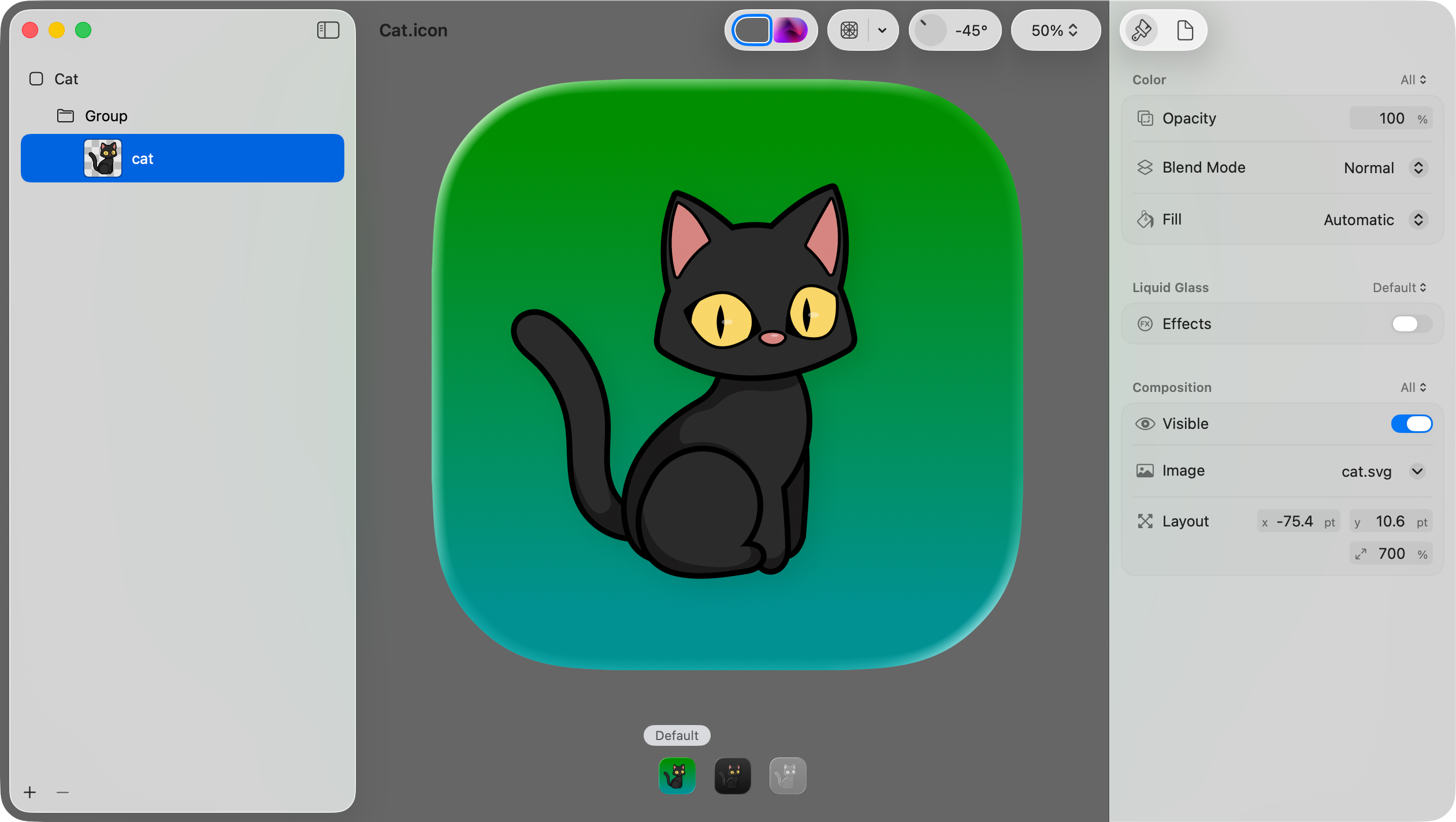
Anyway, with my icon composed, I saved it as Cat.icon and then dragged it in to the project folder, copying it to my app target. Then, in General settings for the app target, I set App Icon to Cat without the extension. After running the app, I right-clicked on its icon in the Dock and selected Options → Show in Finder so I could see the icon fully. It looked pretty good in default mode, but when I used System Settings → Appearance to alter the icon style, it was clear that some of the options would require more work. But still, this was a good start.
If you want to support older systems and have an AppIcon set in Assets.xcassets, set the name of your Icon Composer file to AppIcon and your app will use the new one and fall back to the old one if required.
UPDATE: It appears that the new icon format is now fully backwards compatible. I've tested going back to macOS 11 and it still shows the new Icon Composer icon, even though I have an old-style icon in Assets.xcassets.
One nice touch is that if you select the icon file in the Xcode Project navigator, you get a button under the preview for opening the file in Icon Composer directly.
New look controls
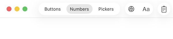
With the introduction of Liquid Glass, many controls have a new look. In the sample app, I added a TabView to group the controls I wanted to test. Tabs have a title and an icon, as they did last year. The default style groups them in the toolbar, although since Beta 3, there is not a lot of transparency:
Notice how this has hidden the window title too.
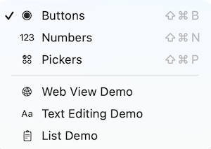
Setting the tabViewStyle to sidebarAdaptable moved the tabs to a sidebar overlay and displays the window title. This looks much more like a standard sidebar and shows the tab icons too. I didn't like the way this looked last year, but I think it fits well with the new UI design. It's like a navigation sidebar but for a static list.
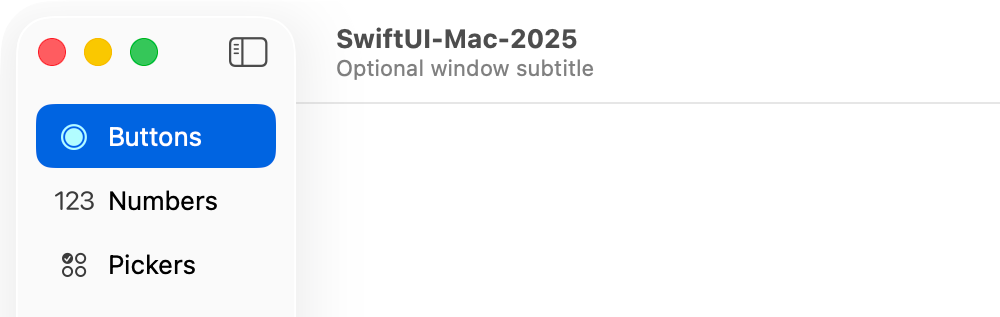
Not only does this style display the window title, but it also allows for a window subtitle using the navigationSubtitle modifier. And it displays a sidebar toggle button. There is a way to remove the sidebar toggle button if it's part of a navigation view, but that technique didn't work here. Despite the style name indicating that this style is adaptable, it only adapts to suit the window size in an iPad app.
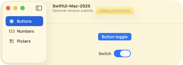
Buttons
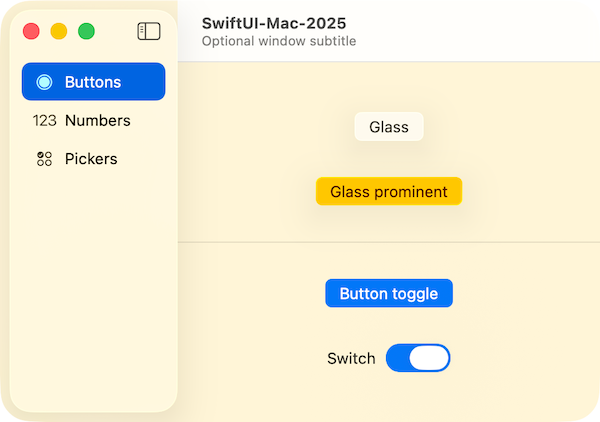
The main change for buttons is the two new options for buttonStyle: glass and glassProminent. Both styles can have a tint applied. I found that with certain tints, the glassProminent style button doesn't show the mouse down effect very distinctly. By default, the glassProminent style is tinted using the accentColor or the user's preferred theme color if chosen.
Toggles have a slightly new look. The button style gives a much more prominent indicator of the selected state, and the switch style uses the new Liquid Glass style which you can really see if you drag the switch instead of clicking on it.
In this screenshot, I've added a background to the view and tinted the glassProminent button. The background looks great with the tab sidebar but the title bar looks a bit jarring:
I wrapped the VStack containing the sample buttons in a ScrollView and that made the title bar transparent and allowed the content to scroll up behind the title bar. Toggle the background on and shrink the window to see this clearly:
Sometimes, this caused a graphical glitch in the This is fixed in beta 5.glassProminent button, but I expect this is a beta issue.
Numbers
For entering numbers, I tested the Slider and Stepper controls. The Slider has the new Liquid Glass style thumb and a cute little bounce of the icons when you reach either end. The step parameter displays tick marks along the slider.
For the stepper, the up and down arrows are larger, which I think is a good idea - they were very small before. There's also a format parameter which has probably been there for years but I've never used it. What I like about it is that it displays the selected value in the format you specify and it's editable! I'm using percent in this example:
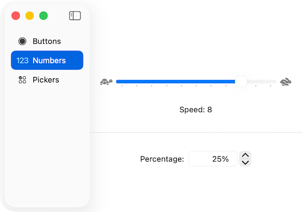
One slight oddity of the stepper showing an editable value is that it lets you enter a value that doesn't match the step size or is inside the range. In this example, I set the step size to 0.05 (5%) and then entered 13%. The arrow buttons still go up and down in 5% increments, so I got 18% or 8% depending on which way I clicked. Also, you can enter a non-numeric value, but it is ignored: tabbing out of the entry resets it, and the arrow buttons operate on your previous entry.
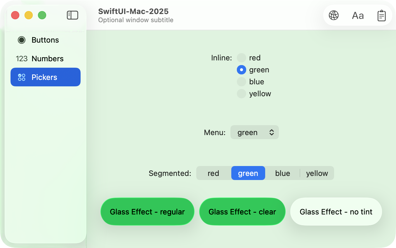
I added a view to test the various Picker styles, but they seem to be the same as last year, so for fun, I added two Text views with glass effects applied:
HStack {
  Text("Glass Effect - regular")
    .padding()
    .glassEffect(.regular.tint(colorForTint))

  Text("Glass Effect - clear")
    .padding()
    .glassEffect(.clear.tint(colorForTint))
}
They take their tint color from the picker selection. The clear style is slightly more translucent than the default regular style but doesn't have as glassy a border. Neither are as glassy as I expected, so I added a ZStack to apply a background of the same color only much less opaque and with a backgroundExtensionEffect to bring the color under the side tab bar:
ZStack {
  colorForTint.opacity(0.2)
    .backgroundExtensionEffect()

  VStack(spacing: 30) {
    // ...
  }
}
I expect it would look even more obvious with an image behind it. Actually, leaving it un-tinted on a color background is a probably the best way to see the effect:
And if you really want to see something unusual, put the app into the background. The three glass effects are all very different.
Web view
One of the most exciting additions for me was the new WebView. So many apps need to display web content, and until now, the only option has been to use NSViewRepresentable or UIViewRepresentable to bring in a WKWebView. The SwiftUI team has exceed my expectations with the features in the new WebView and it's going to need its own article, but I'll cover the two main ways to use it here.
Before working with any web view in a Mac app, you first need to turn on Outgoing Connections (Client) in the Signing & Capabilities for the target. Also, any SwiftUI view that needs to use WebView must import WebKit.
With those in place, here's my code for displaying my web site in a SwiftUI WebView:
import SwiftUI
import WebKit

struct WebDemo: View {
  let myPage = URL(string: "https://troz.net")!

  var body: some View {
    WebView(url: myPage)
  }
}
I have found that the only way to create an invalid URL from a string is to provide an empty string, so I am now happy to force-unwrap URLs. After that, I added a WebView and set its url to myPage:
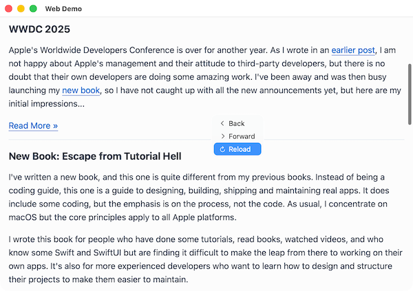
As you can see, a contextual menu offers basic navigation options. So to display any web page off the internet, all you need is the URL.
To gain more control, initialize a WebView with a WebPage:
struct WebDemo: View {
  @State private var page = WebPage()
  let blank = URL(string: "about:blank")!

  var body: some View {
    WebView(page)
      .onAppear {
        page.load(html: html, baseURL: blank)
      }
  }

  let html = """
      HTML goes here (truncated for reading)
    """
}
I added a Picker to the toolbar for switching between the two web view sources. Here's the one showing a local HTML string:
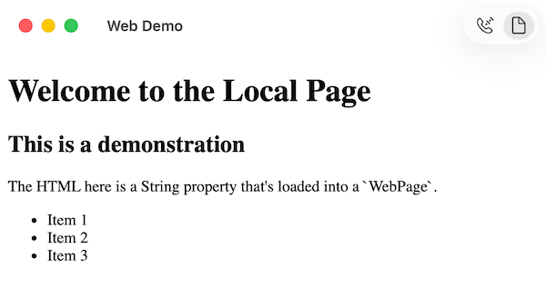
Using a WebPage gives a lot of different options, but this shows the basic idea. I will tend to use a WebPage as that lets me track the loading state so I can show a progress indicator.
Rich text
When I'm asked if I recommend starting a Mac app with SwiftUI or with AppKit, I used to say SwiftUI unless your app uses lists with thousands of entries or long form text editing. SwiftUI lists have improved a lot in macOS this year, but I'm still not sure about that, however it looks like text editing can come off my AppKit list.
The key is to use a TextEditor but to link it to an AttributedString instead of a plain String.
@State private var text: AttributedString = ""

var body: some View {
  TextEditor(text: $text)
}
With an AttributedString, you get a lot of formatting options, although not as many as I expected. Setting bold, italic or underline is easy and so is changing the font size. I have not yet worked out how to change the font, except by pasting in text in a different font. At that point, the newly pasted font becomes one of the document's styles and can be applied to other portions of the text, but this can't be the only way. There is a Show Fonts menu item in Format → Font, but it is always disabled. Spell checking is also a bit erratic - it works really well if you open the spell checker dialog, but it doesn't work as you type.
I added TextEditingCommands and TextFormattingCommands to the menus, but they all seemed to be available through the contextual menu anyway. The Apple Intelligence Writing Tools are also available either through the Edit menu or the contextual menu.
For saving and loading the formatted text, I realized that AttributedString is a Codable type, so I used JSONEncoder and JSONDecoder to save and load as the view appears and disappears. This worked really well, whether I closed the editor window manually or just quit the app. This is just a quick hack for a single editor, but it could be the basis for a more complex app.
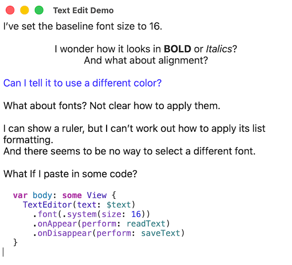
I think there will be more to discover with this, but it's already a lot better than before. And I haven't even started to get into tracking the selection or adding custom formatting.
Long lists
SwiftUI lists on iOS have always performed better than on macOS but this year, macOS is catching up. I added a List Demo window to test out various lengths of list. Before, I found that more than about 3,000 items in a list would cause performance issues, but now I can have 10,000 items and it still feels snappy, both for drawing, scrolling and selecting. With 50,000 items, it's still usable but selection is a bit slow. Interestingly, clearing the list is a big performance hit, but I'm not sure why. 500,000 items takes a very long time to draw. Scrolling is not too bad but selecting a new item takes several seconds. Clearing a list this big takes more than a minute.
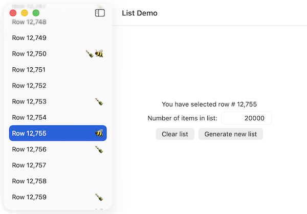
I'm still not convinced that SwiftUI lists are the best way to display long lists, but I'm glad to see some performance improvements. I think my limit would be around 20,000 items, but I'd need to test on various machines.
Menu item icons
A new thing in macOS 26 and iPadOS 26 is icons attached to menu items. Most of the default menu items have icons, but what about my own?
Starting with the Window menu, I see the entries for my three demo windows and the main window:
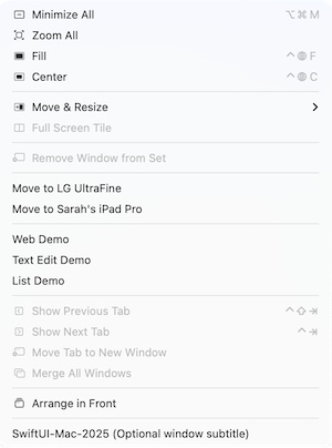
Interestingly, the main window shows the title and its subtitle. I can't see how to add an icon to any of my windows in this menu, but the standard system items all have icons.
What about a menu with items to mimic the tab and toolbar buttons? I added a new Show menu and used a Picker to switch between the main window tab and buttons to open the demo windows. For each one, I used a Label instead of a Text view or a plain title. This let me assign an system image to each. I realize that this means the demo windows each have two menu items, but I wanted to experiment. And anyway, Xcode has two menu items to open the docs.
For the Picker items, I set the pickerStyle to inline and set labelIsHidden to true. I like this style as it gives me a picker at the top level of the menu, instead of in a submenu. For passing the selection to the window, I used @AppStorage which is not a great choice as it makes the choice apply to every open instance of the main window, but I didn't want to get bogged down here. If you're interested in a more complete solution, check out my article on The Mac Menubar and SwiftUI
.
As you can see, I was able to show icons, check marks and keyboard shortcuts. I like this, but it can be over done. The WWDC video on the topic said that if you have related menu items like multiple New or Open options, you should only add an icon to the first.
On a side note, the + button for opening the Library has disappeared from Xcode's toolbar. I'm not sure if this is a bug or a feature but you have to use the View menu now, or the Shift-Command-L shortcut.
Concurrency
This is another thing that is not Mac-specific, but I feel it is important.
Last year, I sat out the change to Swift 6 and its strict concurrency checking. While I could get it to work by following Xcode's suggestions, I was left feeling that I was adding code to make the compiler happy, instead of code that actually made my apps better. This year, things are different. For starters, a new Xcode project has Approachable Concurrency turned on and has Default Actor Isolation set to MainActor. This means that everything is isolated to the main thread by default, but you can step out into a background thread if required.
The default Swift version is still set to 5, but I changed it to 6 for this sample app and had no compile-time warnings or errors. I did use @concurrent when generating the items for the list demo, but it turned out that it was the UI updates on the main thread that were slowing things down, not the data generation. Even so, I prefer the new approach and I'll probably be using Swift 6 from now on.
Toolbars
As you will have seen in the screenshots, I added a toolbar to ContentView with buttons for navigating to various demo windows. I wanted to try out the new floating toolbar features with spacers, so I copied the format from Apple's Landmarks app. This didn't work - all the toolbar items were still grouped together. This turned out to be a feature of using the sidebarAdaptable tab style. When I reverted to a standard tab style, the toolbar appeared with multiple groups as I expected:
There was no logical reason for separating these buttons, but I wanted to test using ToolbarSpacer(.fixed) and ToolbarSpacer(.flexible).
There are a lot of new toolbar positioning options that are not available in macOS. It used to be possible to identify a Catalyst app from its missing Settings menu item. I think that in the future, we'll identify them from toolbars floating in unexpected places!
Looking back at the screenshots from the web view section, the window without a toolbar already looks old-fashioned. Adding the toolbar made it look more modern.
Summary
The big thing this year is Liquid Glass. I have always advocated using default controls wherever possible and for apps that did this, most of the new look will be applied by re-compiling in Xcode 26. I'm not convinced that having content blurring behind a toolbar or title bar is a good idea - it ends up looking like a layout error much of the time. Of the new features, I'm most excited about the WebView so expect a separate article on that soon.
The sample app is available on GitHub: https://github.com/trozware/swiftui-mac-2025.
If you have any feedback about this article, please contact me using one of the links below or through the Contact page. And if you found this useful, please buy me a coffee.