Converting an App from Obj-C
12th September 2024 • 2,211 words • 10 minutes reading time.
A couple of months ago, I got a message from App Store Connect pointing out that one of my iPhone apps - Berio’s Sequenza VII - had not been updated in 3 years and so would be removed from the App Store unless I updated it within 90 days. I disagree with this policy, but small developers like me can't fight Apple. Since I want the app to remain available, I then had to consider how to update it. Once I opened the app project, I realized that the app was written in Objective-C, so I decided to take the plunge and convert it to Swift and SwiftUI.
The app in question is a highly specialized app with an extremely small market - professional musicians or university-level music students who play the oboe. My eldest son fits this category and in 2013, he started to learn a piece called Sequenza VII by Luciano Berio. This is a very strange piece because it doesn't have a standard time signature. Instead each line has 13 bars (measures) with each bar being allocated a certain time span in actual seconds. This means that it's impossible to practice it with a metronome, so I wrote an iPhone app that counted each bar and played a sound or flashed the screen at the appropriate times for each bar. I allowed for slowing the whole thing down for practice, and since the performance is supposed to be accompanied by a constant drone playing in the background, I added that too. I can't say it sells well, but every time someone buys it, I get a warm glow of satisfaction.
I dislike Apple's policy of removing old apps, just because they are old. After all, the piece of music that this app supports was written in 1969 and Berio hasn't updated it since!
There are valid reasons for removing apps from the App Store:
- The app doesn't run on the latest hardware or operating system.
- The app is a scam.
- The app is an obvious clone of another app.
But basing a removal purely on age is an easy thing to automate, so Apple can convince themselves that they are keeping the App Store safe, without actually doing anything to make it safe. In fact, the last time I got one of these notices, I updated the version and build numbers and re-submitted the identical app to the App Store. It was accepted and the notice went away. I fail to see how this did anything except waste my time and the App Store reviewer's time.
Anyway, this time I considered doing the same again, but when I realized the app was still in Objective-C, which I am rapidly forgetting, I decided now was the time to convert it. So I opened up Xcode and created a new project using Swift and SwiftUI. Don't you love the smell of a fresh Xcode project?
There are four main aspects to the app:
- The main screen that shows the bar length and allows control.
- The settings screens that configure the app - there are a lot of options.
- Playing the drone if required.
- The timing functions that work in the background and update the UI as the bars proceed.
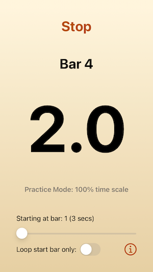
Main Screen
For the main screen, the UI was quite simple and I was able to recreate it in SwiftUI with no problems. The only issue I had was with Text views that are only visible in certain circumstances. I tried hiding them by adjusting opacity which I expected to work, but it didn't, presumably because there wasn't always any text content. I could have solved this using fixed heights, but I didn't want to do that for accessibility reasons. I ended up keeping the views always visible but clearing or setting the text content. By using Spacers and VStacks I was able to keep the layout looking the way I wanted it at all times.
As is my usual habit, I populated the UI with local variables at this stage. This lets me adjust the preview data quickly to make sure the UI works with a range of different values, without having to worry about the actual data flow. Then I plugged in real data later. For the SwiftUI preview, I selected the iPhone SE 3rd generation as the standard device. This is the smallest screen size so everything has to fit on it. Later, I used the iPhone 15 Pro Max to confirm that it all looks good on a large screen too.
The only other trick was to use a .monospacedDigit() for the large counter in the middle of the screen. This stops the numbers jumping around as they change.
Settings
Now on to the settings which take up two screens. In the Objective-C app, I used storyboards. The main screen segued to a tab view with three tabs: two for settings and one for the about screen. The settings views used lots of nested stack views and many, many constraints.
Getting the basic UI elements into SwiftUI was relatively easy, but I wanted them to look good on large or small iPhones. I didn't want something that looked good on an SE being all crammed into the top half of a 15 Pro, but that ended up being more-or-less what I got.
I tried various techniques using nested stacks, spacers, forms, groups and so on. Nothing I tried gave me quite the result I wanted, but I ended up with nested VStacks which allowed me to group related settings. In hindsight, I probably should have swallowed my GeometryReader aversion and used it to adjust the layout spacing, based on the screen size. I'll probably go back and do that later.
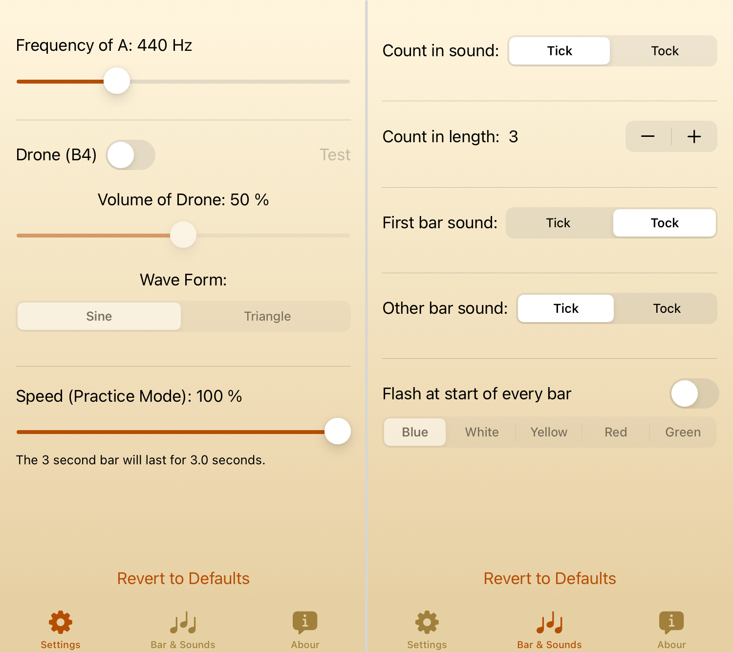
But the most important thing about the setting screens is the settings themselves and here is where SwiftUI really shone. The two view controllers for these pages had masses of code for handling the settings. First, they had to read them in from UserDefaults, providing logical defaults if needed. Then they had to update the UI to reflect the settings. Since several of the settings depended on other settings, monitoring changes meant potentially adjusting other settings and then saving them all back to UserDefaults as well as adjusting all the UI elements manually. And finally, reverting the settings to the standard defaults required even more code and UI updates.
With SwiftUI, I used @AppStorage extensively. Not only did this remove all the hassle of reading and writing to UserDefaults, but it also automatically updated the UI when the settings changed. And by setting up disabled modifiers, the connections between the linked settings were automatic. I was able to remove a lot of code and make the settings screens much simpler and easier to understand. And this flowed on to the main screen when I was adding its data as it used the same @AppStorage properties.
Counting the lines of code using scc, I found the following:
| View | Obj-C | Swift | Reduction |
|---|---|---|---|
| Settings | 173 (13) | 101 (0) | 72 (42%) |
| Bar & Sounds | 166 (18) | 124 (8) | 42 (25%) |
The numbers in brackets after the line count are the complexity ratings. The bar & sounds view is more complex because it has to be able to flash the screen.
Which reminds me of another thing: in the original, I used a background image with a gradient that stretched to fill whatever screen size was in use. In the new version, SwiftUI makes the background gradient itself. I added the start and end colors to the Assets catalog, and now use a LinearGradient which I can change programmatically if the user wants the screen to flash at the start of each new bar.
The Drone
The drone plays a B4 constantly. But some oboists like to adjust the frequency of their basic A from the standard of 440 Hz, so I had to allow for that and adjust the B4 to match.
I am not a sound expert, so in the original app, I imported some third-party code to do this. It's very much C code even though it's written in Objective-C and I do not possess the expertise to convert it to Swift. So in this case, I added the DronePlayer.h and DronePlayer.m files to my new project. When I did this, Xcode kindly offered to create a bridging header for me, which was great because it's been so long since I did this, that I would not have remembered how to do it manually. I did need to check an older project to remember what to put into the bridging header. The format is:
#import "DronePlayer.h"You import the header file (.h), and don't forget the leading # or the import won't work.
After that, I created a Swift class to act as the intermediary between SwiftUI and this Objective-C class and it works very well. I am concerned that this is very old code that may not always work, but hopefully by the time Apple deprecates it, there will be Swift alternatives I can use.
Timing
Finally we get to the most crucial part of the app: timing the bars.
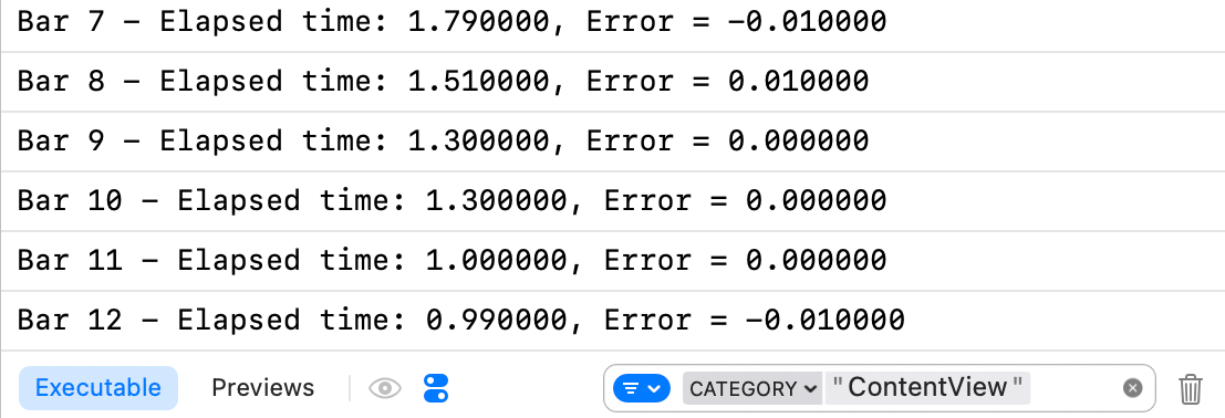
In the original, I used a custom thread with a high priority. While running the main loop, it would compute the time until the next bar and sleep until then. Then it would proceed to the next bar and update the UI. This worked well and when I logged some timing tests, it was accurate to within about 0.01 of a second.
But it all felt very complicated and perhaps unnecessarily accurate, so I started experimenting with using a Timer. That didn't work very reliably, but my next attempt used DispatchQueue.main.asyncAfter and that worked. At the start of the main loop function, I calculate when the next bar should start and call asyncAfter with that time. Then I update the UI so that this never slows down the loop.
This worked quite well but my timing tests showed that the first two bars were always out by about 0.1 seconds. The later bars were more accurate. I can't explain why the longer bars at the beginning of each line were less accurate than the shorter ones, but maybe the internal code that asyncAfter uses to schedule the call is inherently less accurate for longer times.
I decided to have some fun with this inaccuracy and I added routines to track the error of each bar and store that for adjusting the call time the next time round. For example, bar 1 should last 3 seconds. If it took 3.1 seconds, then next time, I apply that 0.1 second error and call it after only 2.9 seconds. After two complete loops, the timings were as accurate as the original, with the added bonus that they would self-adjust to suit if the user's device was busy doing something else in the background.
I used OSLog to track the timings. This takes a bit more effort to set up than print, but it makes it much easier to filter out the logs you're interested in. And since Xcode seems to have got more verbose over the years, being able to filter is very useful.
At the top of my ContentView.swift file, I added:
import OSLogThen, where I was declaring properties, I created a logger:
private let logger = Logger(subsystem: "Berio", category: "ContentView")It seems to be a standard to set the subsystem to an app identifier and the category to the class you're logging. You can use these labels when filtering.
To log my timings, I used:
logger.info("Bar \(runState.barCounter) - Elapsed time: \(elapsedTime), Error = \(error)")Even though I could run the app in the live preview, that didn't produce any log entries, but in the simulator, they appeared. I filtered them to show only the ContentView category and then I was able to track all the timings:
Conclusion
This was an interesting exercise. It is extremely impressive that 11 year old Objective-C code can still build and run with the current Xcode and on current devices. In the Swift world, we do not have such a luxury, but I still feel more comfortable moving forward with Swift. I'm left with the drone code being in Objective-C, but that's a good reminder to me that it is still possible to mix the two languages.
The remaining items on my to-do list are to implement a better layout for the settings pages so that they fill the screen no matter what the screen size. And to keep an eye out for a Swift way of playing a drone at a set frequency with a particular waveform.
Anyway, this has got Apple off my back for another 3 years, at least as far as this app is concerned :-)
And always, I'd love to hear from you if you have any suggestions, corrections or improvements. If you are an oboe student, let me know which music school you are at and I'll send you a discount code for the app.
You can contact me using one of the links below or through the Contact page. And if you found this article useful, I'd love you to buy me a coffee.