SwiftUI Color
9th May 2020 • 1,409 words • 7 minutes reading time.
As developers, we are used to thinking of color as a numeric way to specify a particular tint. But in SwiftUI, Color - like almost everything else - is actually a View in its own right. This leads us to two very interesting questions: how do we use a view to specify a color and how can we use the fact that Color is View?
Specifying a Color
To start my investigations of Color, I created a new iOS single view app in Xcode. Regular followers will know that I am a passionate advocate of macOS programming, but when experimenting with SwiftUI, I prefer to use an iPhone app as the preview canvas fits very neatly into the main Xcode window.
The default ContentView contains a single Text view. To change the color of the text in this view, I added a modifier:
  Text("Hello, World!")
      .foregroundColor(.red)
The foregroundColor modifier expects a Color so there was no need to tell it that the parameter is a Color and I was able to use the short way of describing one of the standard colors.
Adding a background color is a bit different because a background can be any view, not just a color. So the modifier needs to specify that this is a Color view, as well as setting the actual color.
    Text("Hello, World!")
        .padding()
        .foregroundColor(.red)
        .background(Color.yellow)
I added the padding to make the overall size bigger so that the background color was more obvious.
Command-click on .red or .yellow in the code and select "Jump to Definition". This lists the available pre-defined colors. As well a set of basic colors and a clear option, there are two extra entries: primary & secondary. And if you scroll back up the page a bit, you will see another one: accentColor.
Choosing one of the preset options is the easiest way to select a color. But try this:
In your code, type let uiColor = UIColor. and have a look at the auto-complete suggestions that appear after you type the period. Scrolling past the various init methods, you will see that UIColor has a lot more options than Color. There are a bunch of colors, a section of system colors and a lot of semantic colors like placeholderText, secondarySystemBackground.
Why does UIColor get these other useful looking options and Color does not?
Well, I don't have an answer to that except that I hope they will appear over time. But in the meantime, it is easy enough to create a SwiftUI Color from a UIColor.
    let backgroundColor = Color(UIColor.secondarySystemBackground)

    var body: some View {
      VStack {
        Text("Hello, World!")
      }
      .background(backgroundColor)
    }
If you know the RGB values of the color you want to use, it is possible to create a Color directly by various methods like this one for setting the color using the RGB values.
let rgbColor = Color(red: 1.0, green: 0.5, blue: 0.5)But when you get to this stage, I strongly suggest that you start using color assets instead.
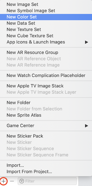
Using Color Assets
Go to Assets.xcassets and click the plus button at the bottom of the list of assets. Select "New Color Set" and you will get a new asset called "Color". You can double-click the name to edit it to something that makes sense to you.
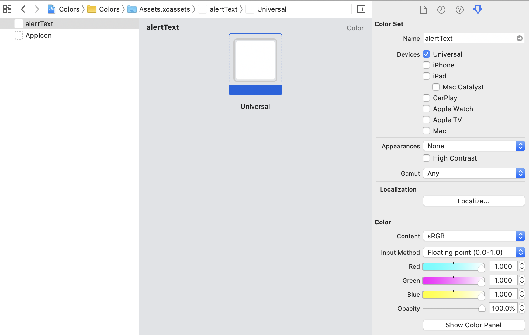
While naming it after the color may seem logical, I prefer to think about the use cases for this color and set the name to something like "cardBackground" or "alertText".
By default, your new color set will contains a single color block. Click in the color block itself and then you will be able to edit the color in the Attributes Inspector. If you click the "Content" popup, you will get access to all the system colors, and you can also select any color space and create a custom color using that color space. Click "Color Panel" to access a standard color picker if you need it. And change the input method to whatever suits the color information you have.
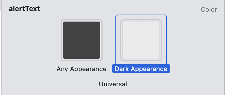
Modern apps need to be able to handle light and dark modes, and this is where using a color set really shines. Set the color to what you want to use for light mode and then choose "Any, Dark" from the Appearances popup menu in the Attributes Inspector.
Now your color set has two blocks and you can change the Dark one to whatever color this should be in dark mode. This feature of Color Sets is a very strong argument for using them instead of defining colors using their RGB values.
And now for the really neat part. To use any of these color sets in your code, add a modifier like foregroundColor just the same as usual, but when the placeholder for the color is selected, press Shift-Command-L to bring up the Library palette and choose the Color icon at the right. You will see all your color sets there and you can insert them easily and accurately.
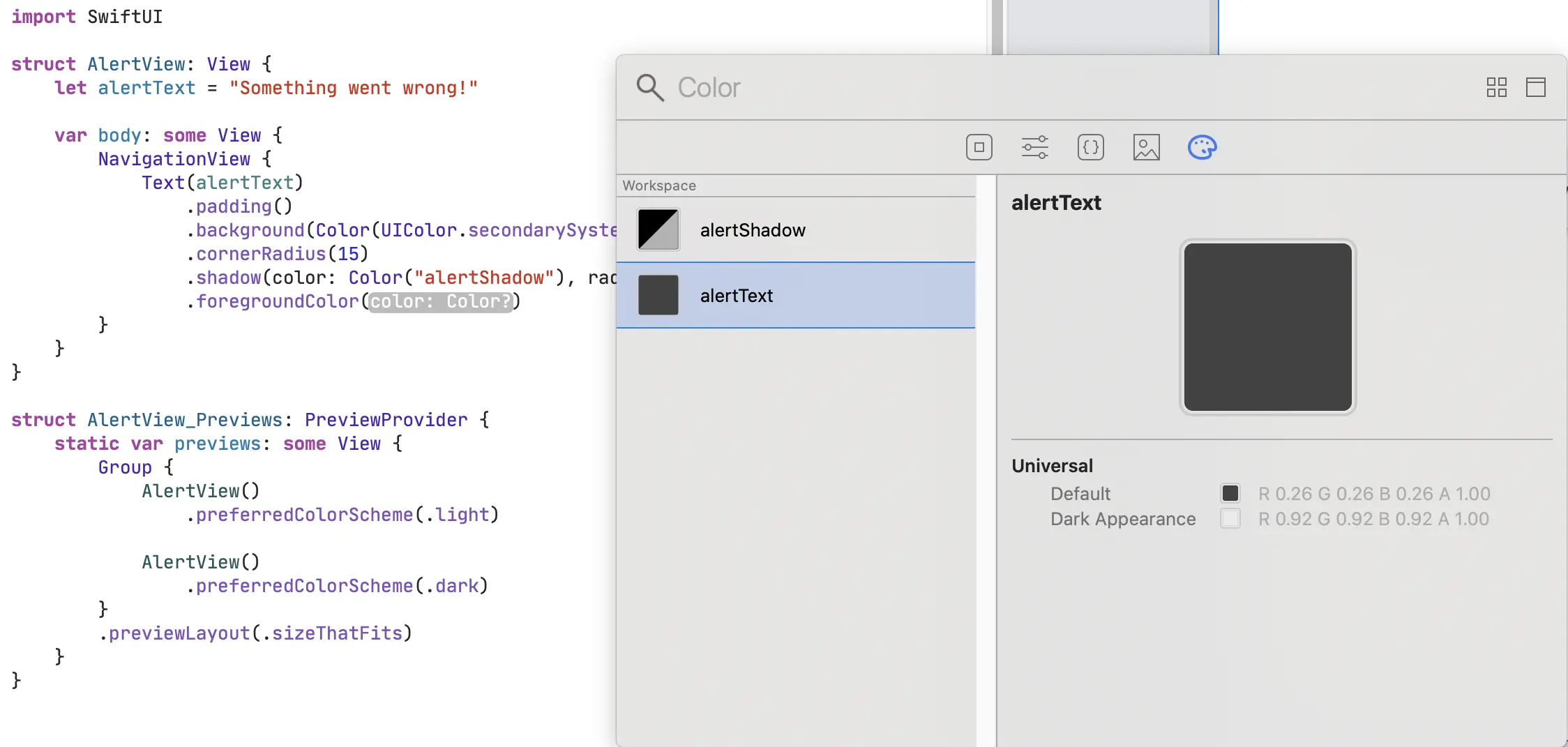
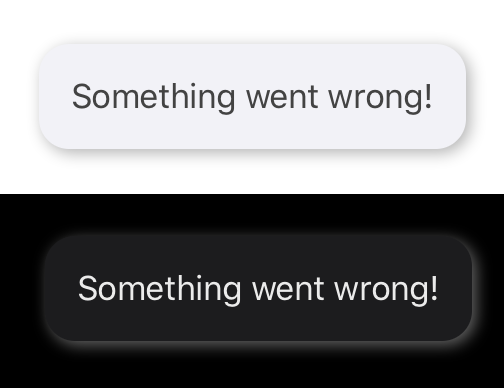
Here is the code for my AlertView using two color sets.
Some people may object to using "magic strings" to specify the color sets but I feel that so long as the Library is used to insert the color names automatically, there is very little chance of error. But you could always make an enum or struct of color name constants and use these instead.
struct AlertView: View {
    var alertText = "Something went wrong!"

    var body: some View {
        Text(alertText)
            .padding()
            .background(Color(UIColor.secondarySystemBackground))
            .cornerRadius(15)
            .shadow(color: Color("alertShadow"), radius: 5, x: 1, y: 1)
            .foregroundColor(Color("alertText"))
    }
}

struct AlertView_Previews: PreviewProvider {
    static var previews: some View {
        Group {
            AlertView().preferredColorScheme(.light)
            AlertView().preferredColorScheme(.dark)
        }
        .previewLayout(.sizeThatFits)
    }
}
And here is a composite image showing the two versions of the alert with the colors specified by two color sets:
Light & Dark Mode System Colors
Color's preset colors adapt automatically to the environment so that they work with dark mode or light mode just like your own Color Sets can.
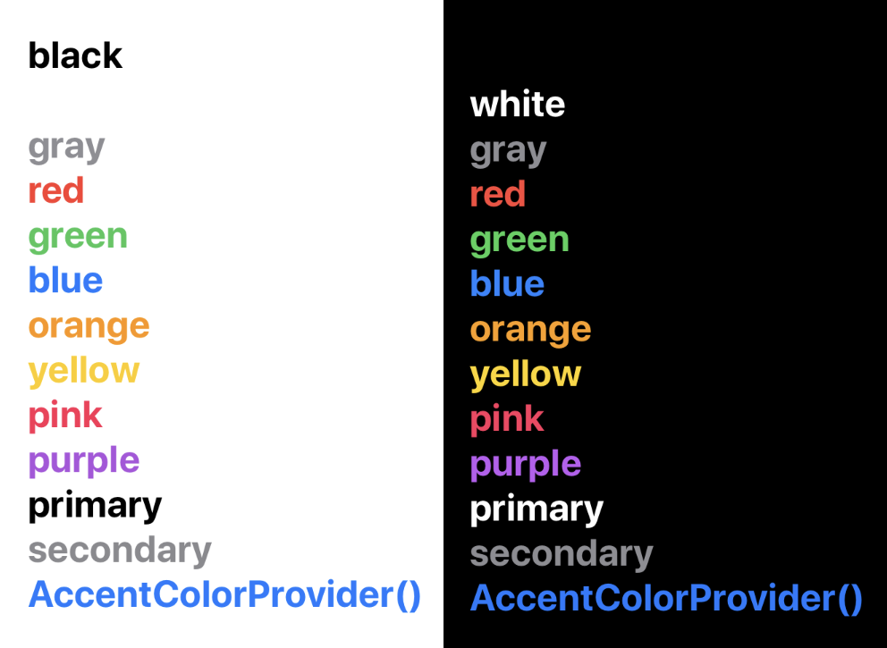
I wrote a test view to loop through all the preset colors (except clear) and display their descriptions in their own color.
struct ContentView: View {
    let standardColors: [Color] = [
        .black, .white, .gray, .red, .green, .blue, .orange,
        .yellow, .pink, .purple, .primary, .secondary, .accentColor
    ]

    var body: some View {
        VStack(alignment: .leading) {
            ForEach(standardColors, id: \.self) { color in
                Text(color.description)
                    .bold()
                    .foregroundColor(color)
            }
            .font(.title)
        }
        .padding()
    }
}

struct ContentView_Previews: PreviewProvider {
    static var previews: some View {
        Group {
            ContentView().preferredColorScheme(.light)
            ContentView().preferredColorScheme(.dark)
        }
    }
}
The canvas shows two previews: one for light mode and one for dark mode.
If you have a color picker app (I use Colorpicker), you can detect the RGB values in the two previews. I made the font bold to make this easier. Red is rgb(232, 77, 61) in light mode but rgb(233, 85, 69) in dark mode. And the others have similar modifications to make them look their best in each environment.
Take particular note of the three at the bottom of the list: primary, secondary and accentColor. These are incredibly useful when making a layout that works in both light and dark modes.
When choosing a UIColor or NSColor, it is best to use the system versions, so .systemBlue instead of .blue as this gives the dark/light variants that we just saw. And the other semantic colors like UIColor.secondarySystemBackground also have dark/light variants automatically.
Color as a View
Now let's consider the effect of Color being a view and not just a description of a tint. Imagine you wanted to draw a colored box on the screen. Using UIKit, you would probably think of using a UIView. With AppKit, maybe an NSBox. Or perhaps you would have jumped straight to a Bezier path.
Create a new SwiftUI view and replace the default Text with a Color, like this:
struct BoxView: View {
    var body: some View {
        Color.blue
    }
}
Resume the canvas preview and you will see the color fill the preview iPhone screen, except for the safe areas top and bottom.
To make this into a box, add a frame modifier with the required height and width. And now you have a box, far more easily than you could in either UIKit or AppKit.
To be honest, in SwiftUI, you would probably use a Rectangle instead of a plain Color if you wanted a box of a set size but it is interesting to consider how Color could be made to work.
A more valuable use of Color is to set the background.
struct BackgroundView: View {
    var body: some View {
        ZStack {
            Color.green

            Text("Hello, green background")
        }
    }
}
This makes the entire background green and shows the text centered on it.
And to make the color extend into the safe areas:
Color.green.edgesIgnoringSafeArea(.all)I prefer to put the edgesIgnoringSafeArea modifier on the Color only and not on the entire ZStack. That way the other contents of the ZStack will all stay inside the safe area.
So in summary, use preset colors or color assets to set your colors. And use the Color view to set a background color for a view.
I hope you found this article useful, and if you have any suggestions, corrections or improvements, please contact me using one of the links below or through the Contact page.