Moving to the Dark Side - Part 2
5th October 2018 • 320 words • 2 minutes reading time.
Now that most of my Mac apps have been updated to support macOS Mojave's dark mode, it was time to turn my attention to this web site.
I build this site using Hugo and up until recently I used a theme called Even which I had been able to modify to suit my requirements. The story of how I switched to Hugo, what I wanted in a theme and how I went about, is in a post from last year.
But Evan is a theme with a white background and dark text, which looked great in light mode, but rather glaring in dark mode. So it was time to head for the Hugo Themes page to look for an alternative.
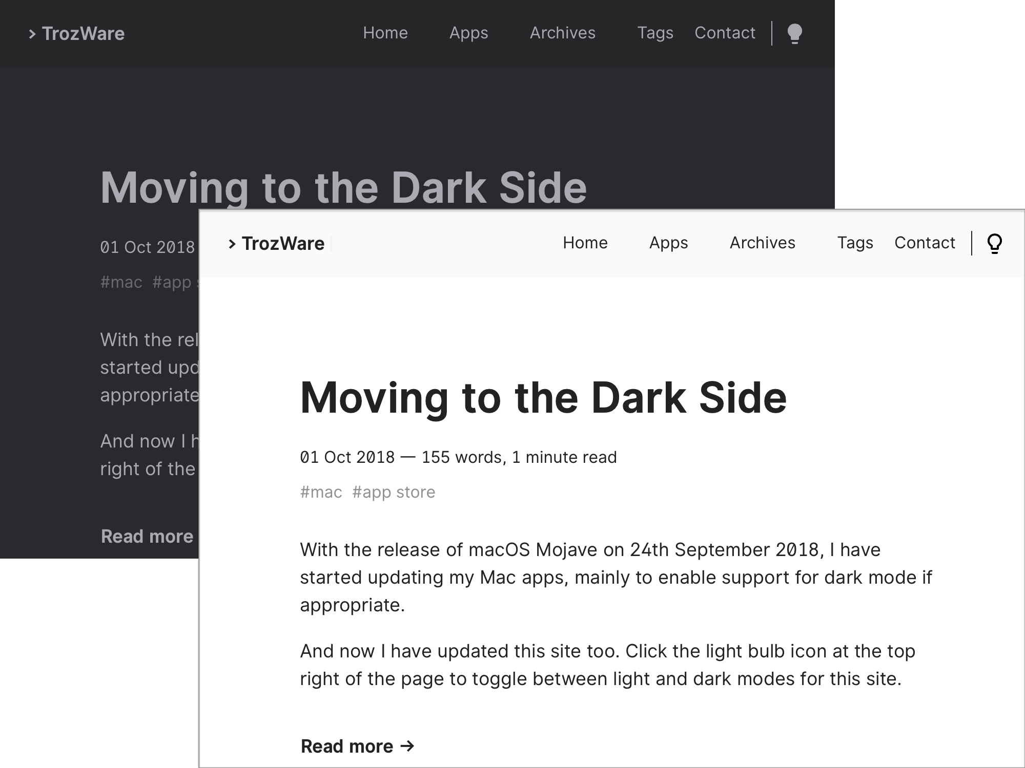
But which way to go? In my opinion, dark themes look better in Mojave's light mode than light themes look in dark mode, so I decided to go with a dark theme. But to my delight, I found a theme that allowed users to switch between light and dark modes: Hello Friend by panr. Click the light bulb icon in the top right and the web site instantly toggles between modes.

With the spread of dark mode, I would expect more web sites and themes to implement this sort of switching in the future. Thanks to panr for being an early adopter.
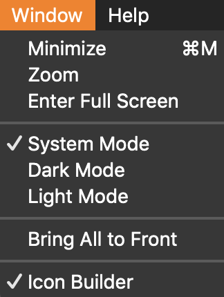
As I said in my previous post, I have already updated several of my macOS apps to support dark mode. But after reading some comments on Twitter, I have updated Icon Builder and Dice Pass to allow the user to decide which mode to use. Make your choice in the Window menu as to whether these apps use whatever mode is set for the system, or select your preferred mode.
