Mark Time
11th December 2017 • 904 words • 4 minutes reading time.
Mark Time is an application for Celestial Navigation that solves the problem of how to take an accurate time reading to go with each sextant sighting. Here is how it was developed...
A day in the life of a software developer - "it would be great if there was an app that did..."
One of the family is learning celestial navigation and was struggling with the problem that you either need a partner or more than 2 hands. The key factor is that you need to record the exact time at the moment when you take your sighting. And this time has to be in UTC to make your subsequent calculations work.
Since this is a very simple app, I decided it would be fun to describe the development process from first specifications to release in the App Store.
The Basic Specs
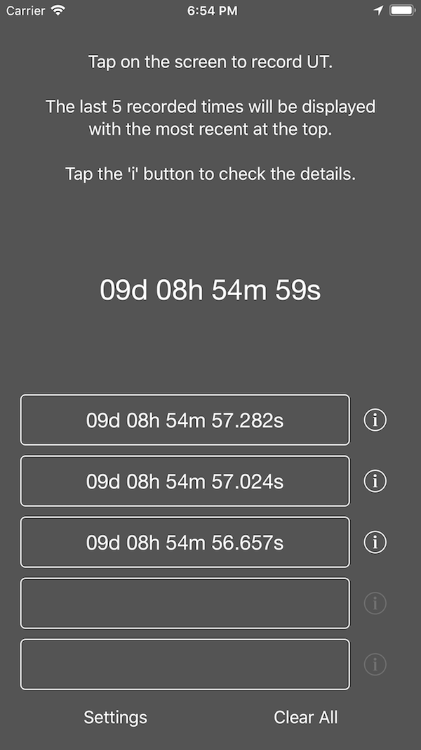
- tap anywhere on the screen to record the time
- convert the time to Universal Time (UT)
- display that time in a specific format: DD:HH:MM:SS
- store the last 5 tap times
A UITapGestureRecognizer over the entire view solved the first requirement.
The native Date object handles time zone conversions perfectly, and then it
was a matter of configuring a DateFormatter with a custom format string to
provide the required date display.
The last 5 times are stored in UserDefaults and displayed in reverse order so
the most recent is always at the top.
UI considerations
- colour scheme must work in bright sunlight
- text should use dynamic sizing so it works if people adjust the text size on their iPhones
- the UI elements must be out of the way of the new iPhone X system gestures.
- while it will most likely be used on iPhones, allow for iPads as well
I had done extensive tests of colour schemes when developing my golf scoring app, so I already had the answer to the colours question: dark grey background with white text.
Allowing for dynamic type should have been easy - choose a font style e.g. body, headline, title 1 and set it to adjust automatically. But with a display that is mainly numeric, the display looked terrible because the numbers in the default San Francisco are non-proportional. So I switched to Helvetica Neue and watched for dynamic font size changes manually.
The iPhone X should be fine since I used the new safe area layout guides.
For iPad, I didn't make a lot of UI changes since I don't expect it to be used much, but the display is bigger and probably easier to read.

Refinements
As always, once the first few iterations have been through the testing process, there were a few things that needed changing and then feature creep set in...
- change the date format to be more readable
- change the basic tap gesture so that it triggers on tap down, not tap up
- add a button to clear all the stored data
- display the current time in UTC and in the same format
- cheat mode - record latitude and longitude for each time so the calculations can be checked
- change the format for showing the latitude and longitude
- sound & haptics to provide feedback
- settings
The date format was DD:HH:MM:SS so for 12th December at 1:01:46 pm, this would show 12:13:01:46 which we decided was a bit confusing. One tended to assume the first section was actually the hours. Under the new scheme, that same date displays as 12d 13h 01m 46.654s. The extra precision on the seconds was to show that the time really was changing if you tapped multiple times quickly.
To make the time record immediately, I removed the UITapGestureRecognizer and
placed UIButtons covering all the relevant active areas. They respond on Touch
Down for a much faster reaction.
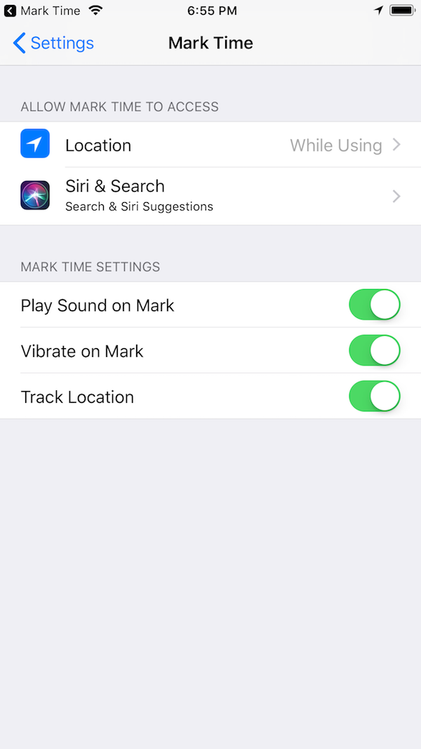
Usually, I make a separate View Controller for preferences. This time, because the app needed access to the standard Settings app for Location services, I decided to add the app's preferences to the app's page in the Settings app. This worked really well, and made the app itself smaller and simpler.

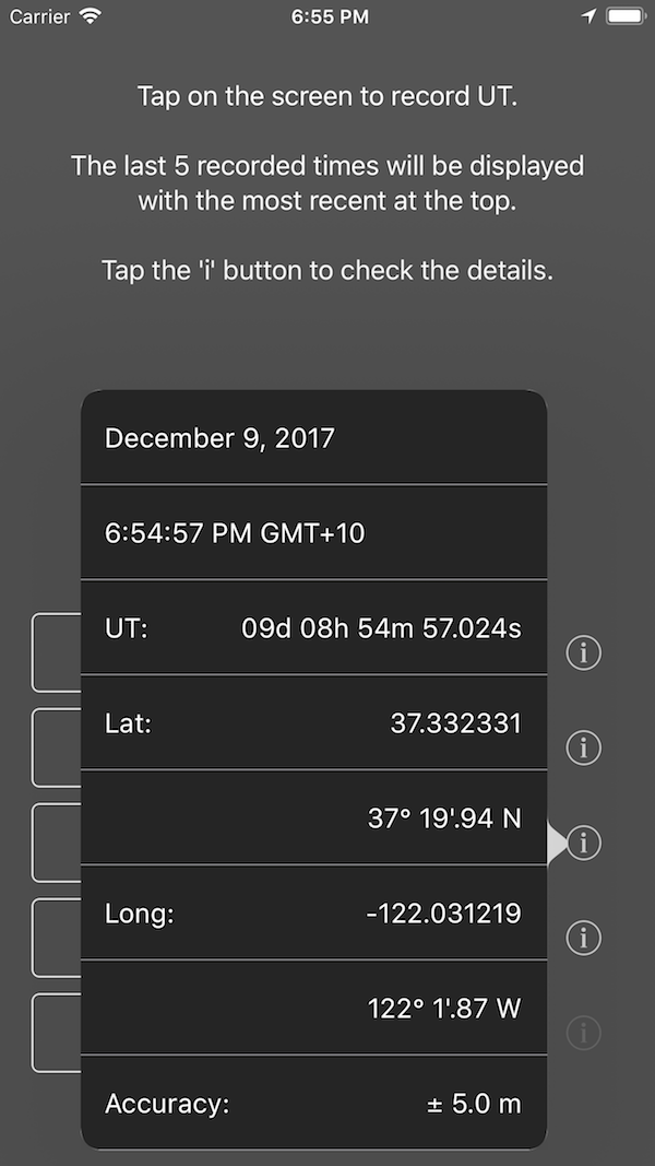
In cheat mode, the location is recorded at every tap and then the info button beside each time shows the details. This needed to handle the permissions required for accessing the user's location. The latitude and longitude are shown in decimal format and at first, I also showed them in DMS (degrees, minutes, seconds) format. I found out that for navigation calculations, they prefer to see degrees and decimal minutes, no seconds. And rather oddly, this is displayed something like this: 153° 22'.84 E
Sounds and haptics were added, configurable through Settings. The sound was a nice loud double-beep designed to be clearly audible to tell you when you had recorded a time.

Release
After numerous rounds of TestFlight, I was ready to release. The app was submitted to iTunes Connect and ready for review on Dec 9, 2017 at 7:36 PM. It moved into review on Dec 11, 2017 at 8:07 AM and was ready for sale on Dec 11, 2017 at 10:19 AM. So less than 39 hours from start to finish of the review process for a new app - things have certainly changed!
The app is free - you can get it from the iTunes App Store.